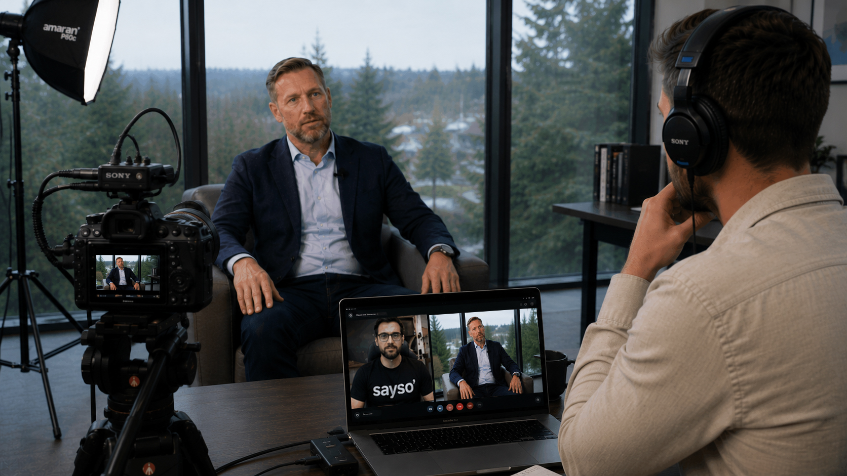
// Sayso vs Testimonial Hero — comparison landing.
// Reuses the Performance Clips v2 design language (atoms + classes from
// site.jsx / sections2.jsx). Only the copy and a few comparison-specific
// layouts are new; every visual token comes from the existing system.

const TH_CSS = `
  /* hero secondary link */
  .th-link { font:600 16px/1 var(--font-sans); letter-spacing:-0.01em; color:var(--brand-600);
    text-decoration:none; position:relative; transition:color .15s; }
  .th-link:hover { color:var(--brand-700); }
  .th-link::after { content:""; position:absolute; left:0; right:100%; bottom:-3px; height:1.5px;
    background:currentColor; transition:right .22s cubic-bezier(.2,0,0,1); }
  .th-link:hover::after { right:0; }

  /* section eyebrow — quiet editorial marker: text only, no pill, with a soft
     light-reflection glow underneath (no hard line, no border) */
  .th-label { position:relative; display:inline-flex; align-items:center; gap:7px; padding:0 2px 12px;
    background:transparent; border:0;
    font:600 12px/1 var(--font-sans); letter-spacing:.16em; text-transform:uppercase; color:var(--text-secondary); }
  .th-label::after { content:""; position:absolute; left:50%; bottom:-4px; transform:translateX(-50%);
    width:240px; height:34px; pointer-events:none; filter:blur(7px);
    background:radial-gradient(50% 54% at 50% 30%, rgba(255,255,255,0.8), rgba(255,255,255,0) 72%); opacity:0.7; }
  .th-label .dot { width:5px; height:5px; border-radius:999px; background:var(--brand-600); flex:none; }
  .th-label.dark { background:transparent; border:0; color:rgba(255,255,255,0.8); }
  .th-label.dark::after { background:radial-gradient(50% 54% at 50% 30%, rgba(255,255,255,0.34), rgba(255,255,255,0) 72%); opacity:0.5; }
  @media (max-width:767px) {
    .th-label { letter-spacing:.2em; color:var(--text-tertiary); }
    .th-label .dot { display:none; }
    .th-label.dark { color:rgba(255,255,255,0.66); }
  }

  /* trust — animated logo marquee (matches Performance Clips) */
  .th-marqsec { padding:76px 0 8px; }
  .th-mhead { text-align:center; font:400 15px/1 var(--font-sans); color:var(--text-tertiary); }
  .th-mhead strong { font-weight:600; color:var(--text-primary); }
  .th-tick { width:1px; height:30px; margin:14px auto 0; background:rgba(0,0,0,0.22); }
  .th-band { position:relative; border-top:1px solid rgba(0,0,0,0.1); }
  @keyframes thMarq { from { transform:translateX(0); } to { transform:translateX(-50%); } }
  .th-marq { overflow:hidden; padding:48px 0; }
  .th-track { display:flex; align-items:center; gap:64px; width:max-content; animation:thMarq 44s linear infinite; }
  .th-band:hover .th-track { animation-play-state:paused; }
  .th-fade { position:absolute; top:0; bottom:0; width:160px; z-index:2; pointer-events:none; }
  .th-mlogo { object-fit:contain; opacity:.6; filter:grayscale(100%); transition:opacity .25s, filter .25s, transform .25s; }
  .th-mlogo:hover { opacity:1; filter:grayscale(0); transform:translateY(-2px); }
  @media (prefers-reduced-motion: reduce) { .th-track { animation:none; } }
  /* mobile logo wall — Ads style: full-bleed muted surface, hairline-separated cells */
  .th-trustband-m { display:none; }
  @media (max-width:767px) {
    .th-marqsec { padding:28px 0 34px; }
    .th-tick, .th-band { display:none; }
    .th-mhead { font:600 10.5px/1 var(--font-sans); letter-spacing:.1em; text-transform:uppercase;
      color:var(--text-tertiary); margin-bottom:20px; }
    .th-mhead strong { font-weight:600; color:var(--text-tertiary); }
    .th-trustband-m { display:block; background:var(--bg-grey);
      border-top:1px solid var(--line); border-bottom:1px solid var(--line); }
    .th-mgrid { display:grid; grid-template-columns:repeat(3,1fr); gap:1px; background:var(--line); }
    .th-mgrid .cell { background:var(--bg-grey); display:flex; align-items:center; justify-content:center;
      min-height:78px; padding:14px 10px; }
    .th-mgrid img { width:auto; max-width:90px; object-fit:contain; opacity:.5; filter:grayscale(100%); }
  }

  /* "The real saving" — light section: one anchor quote card + three compact
     secondary benefit cards, following the same light DS card spec used
     elsewhere (white fill, hairline border, soft shadow, radius-md). */
  .th-diffsec { background:#FAFAFA; }
  .th-saving { max-width:900px; margin:0 auto; display:flex; flex-direction:column; align-items:center; text-align:center; }

  /* the customer quote — large editorial statement, centered */
  .th-saving-quote { max-width:900px; margin:0 auto; font:700 clamp(24px,2.9vw,37px)/1.4 var(--font-sans);
    letter-spacing:-0.025em; color:var(--text-primary); text-align:center; text-wrap:pretty; }
  .th-saving-quote .qm { color:var(--brand-600); font:700 2.1em/0 var(--font-sans); vertical-align:-0.30em; }
  .th-saving-quote .qm.o { margin-right:0.075em; }
  .th-saving-quote .qm.c { margin-left:0.05em; }
  .th-saving-attr { display:flex; align-items:center; justify-content:center; gap:13px; width:100%;
    max-width:900px; margin:32px auto 0; padding-top:22px; border-top:1.5px solid rgba(20,18,16,0.14); }
  .th-saving-avwrap { flex:none; width:46px; height:46px; }
  .th-saving-avwrap image-slot, .th-saving-avwrap img { display:block; width:46px; height:46px;
    object-fit:cover; border-radius:999px; border:1px solid var(--line); }
  .th-saving-attr .nm { font:600 15px/1.2 var(--font-sans); color:var(--text-primary); text-align:left; }
  .th-saving-attr .rl { font:400 13px/1.3 var(--font-sans); color:var(--text-tertiary); margin-top:2px; }
  .th-saving-attr .lg { height:14px; width:auto; margin-left:16px; flex:none; opacity:.7; filter:brightness(0); }

  /* hero risk-reversal pill — quiet trust support */
  .th-cancel-pill { display:inline-flex; align-items:center; gap:8px; padding:6px 13px; border-radius:999px;
    background:rgba(255,35,140,0.06);
    font:500 12px/1 var(--font-sans); letter-spacing:-0.005em; color:var(--brand-700); opacity:.85; white-space:nowrap; }

  /* hero hierarchy */
  .th-eyebrow { position:relative; overflow:hidden; display:inline-flex; align-items:center; gap:9px; padding:9px 22px; border-radius:999px;
    background:transparent;
    box-shadow:inset 0 0 14px rgba(255,35,140,0.06);
    font:500 12.5px/1 var(--font-sans); letter-spacing:.06em; text-transform:uppercase;
    color:var(--text-primary); white-space:nowrap; }
  .th-eyebrow::before { content:""; position:absolute; inset:-70%; z-index:0; pointer-events:none;
    background:radial-gradient(ellipse 40% 115% at 50% 50%, rgba(255,35,140,0.2), rgba(255,255,255,0) 55%);
    transform:rotate(-45deg); }
  .th-eyebrow > * { position:relative; z-index:1; }
  .th-eyebrow::after { content:""; position:absolute; inset:0; border-radius:inherit; pointer-events:none;
    border:0.5px solid rgba(255,35,140,0.15); filter:blur(1px); }
  .th-eyebrow .vs { color:var(--brand-600); font-weight:600; }
  .th-hero-h1 { font:700 clamp(42px,6.2vw,85px)/1.0 var(--font-sans); letter-spacing:-0.04em;
    color:var(--text-primary); text-transform:uppercase; text-wrap:balance; }
  .th-hero-h1 .th-ap { margin:0 0.012em 0 0.006em; }
  .th-hero-sub { font:500 clamp(22px,2.8vw,36px)/1.12 var(--font-sans); letter-spacing:-0.025em;
    color:var(--text-secondary); text-wrap:balance; }
  .th-hero-micro { font:400 17px/1.4 var(--font-sans); letter-spacing:-0.005em; color:var(--text-tertiary); }
  /* hero subheadline — the model-difference punchline */
  .th-hero-punch { display:flex; flex-direction:column; align-items:center; text-align:center; gap:8px;
    font:600 clamp(21px,2.5vw,29px)/1.3 var(--font-sans); letter-spacing:-0.018em; text-wrap:balance; }
  .th-hero-punch .them { color:var(--text-tertiary); font-weight:500; }
  .th-hero-punch .you { color:#181818; font-weight:600; }
  /* new hero direction — headline + continuation + turn + proof line */
  .th-hero-h1 .th-h1-l1, .th-hero-h1 .th-h1-l2, .th-hero-h1 .th-h1-l3 { display:block; }
  .th-hero-cont { font:500 clamp(24px,2.82vw,35px)/1.12 var(--font-sans); letter-spacing:-0.02em;
    color:var(--text-secondary); text-wrap:balance; max-width:38ch; text-align:center; margin-left:auto; margin-right:auto; }
  .th-hero-turn { font:600 clamp(23px,2.7vw,35px)/1.15 var(--font-sans); letter-spacing:-0.03em;
    color:var(--text-primary); text-align:center; }
  /* hero comparison block — two-column, column vs column */
  .th-vs { display:flex; flex-direction:column; align-items:center; }
  .th-vs-grid { display:grid; grid-template-columns:1fr 1fr; column-gap:40px; row-gap:10px;
    max-width:640px; margin:20px auto 0; align-items:baseline; grid-auto-rows:min-content;
    position:relative; }
  .th-vs-grid::before { content:""; position:absolute; top:0; bottom:0; left:50%; width:1px;
    background:var(--line); transform:translateX(-0.5px); }
  .th-vs-grid .them { text-align:right; color:var(--text-tertiary); white-space:nowrap;
    font:500 clamp(18.05px,2.09vw,24.7px)/1.4 var(--font-sans); letter-spacing:-0.02em; }
  .th-vs-grid .you { text-align:left; color:#181818; font-weight:600; white-space:nowrap;
    font:600 clamp(18.05px,2.09vw,24.7px)/1.4 var(--font-sans); letter-spacing:-0.02em; }
  .th-vs-src { font:400 11.7px/1.4 var(--font-sans); color:var(--text-tertiary); opacity:.6; margin:26px 0 0; }
  @media (max-width:767px) {
    /* mobile: comparison becomes a compact proof strip, detached from the hero
       message and reordered to sit AFTER the CTA (order set below, in the
       main mobile hero block) with reduced visual weight. */
    .th-vs { border-top:1px solid var(--line); padding-top:18px !important; width:100%; max-width:280px; opacity:.92; }
    .th-vs-grid { column-gap:16px; row-gap:8px !important; margin-top:0 !important; }
    .th-vs-grid .them, .th-vs-grid .you { font-size:13.5px !important; white-space:normal; }
    .th-vs-grid .you { font-weight:600 !important; }
  }
  .th-hero-proof { font:500 clamp(22px,2.04vw,25px)/1.5 var(--font-sans); letter-spacing:-0.01em; color:var(--text-primary); text-align:center; }
  .th-hero-cta .pc-btn { font-size:25px; font-weight:400; height:56px; padding:0 34px; }
  @media (max-width:767px) {
    /* hero — Ads-page mobile scale & rhythm (pill → tight H1 → subcopy → CTA → price line) */
    /* subtle "Testimonial Hero vs Sayso" context line above the headline */
    .th-hero-ctx { font:500 12px/1 var(--font-sans) !important; letter-spacing:.02em;
      color:var(--text-tertiary); margin-bottom:14px; }
    .th-hero-ctx em { font-style:normal; opacity:.6; margin:0 4px; }
    .th-hero-ctx .pc-pink { color:var(--brand-600); font-weight:600; }
    #top .pc-wrap { padding-top:18px !important; padding-bottom:0 !important; }
    /* eyebrow pill — same treatment as the Ads page mobile pill */
    .th-hero-pill { align-items:center; gap:7px; padding:7px 15px; border-radius:999px;
      border:1px solid rgba(255,35,140,0.24); background:rgba(255,255,255,0.65); backdrop-filter:blur(4px);
      font:600 11.5px/1 var(--font-sans); letter-spacing:.13em; text-transform:uppercase; color:var(--text-secondary); }
    .th-hero-h1 { font-size:38px !important; line-height:0.96 !important; letter-spacing:-0.03em !important; margin-top:0 !important; }
    /* three tight lines: YOU DON'T NEED / ANOTHER / HERO. (HERO stays brand pink) */
    .th-hero-h1 .th-h1-l1, .th-hero-h1 .th-h1-l2, .th-hero-h1 .th-h1-l3 { display:block; }
    /* subcopy: farther below the headline, lines closer to each other, gentler weight */
    .th-hero-punch { font-size:16px !important; line-height:1.35 !important; gap:2px !important; margin-top:22px !important; }
    .th-hero-punch .them { font-weight:400 !important; }
    .th-hero-punch .you { font-weight:600 !important; }
    .th-vs-src { display:none !important; }
    /* reorder: hero message → CTA → compact comparison strip (comparison
       detaches visually from the hero via the border-top rule above and
       drops down below the CTA, instead of sitting inside the same block) */
    .th-vs { order:3; margin-top:24px !important; }
    .th-hero-cta { order:4; margin-top:16px !important; gap:8px !important; }
    .th-hero-cta .pc-btn { height:48px !important; padding:0 26px !important; font-size:15.5px !important; }
    /* supporting info under CTA — regular weight, tertiary color */
    .th-hero-micro { font-size:12.5px !important; line-height:1.5 !important; font-weight:400 !important; }
    .th-hero-proof { font-size:19px !important; }
    .th-hero-cont { font-size:19px !important; margin-top:16px !important; max-width:24ch !important; }
    .th-hero-turn { font-size:21px !important; margin-top:22px !important; }
  }
  .th-cancel-pill .pk { width:6px; height:6px; border-radius:999px; background:var(--brand-600); flex:none; }

  /* feel-it metric strip */
  .th-metrics { display:grid; grid-template-columns:repeat(3,1fr); gap:0; }
  .th-metric { text-align:center; padding:6px clamp(16px,3vw,40px); }
  .th-metric + .th-metric { border-left:1px solid var(--line); }
  .th-metric .n { font:700 clamp(40px,5vw,52px)/1 var(--font-sans); letter-spacing:-0.03em; color:var(--brand-600); }
  .th-metric .l { font:500 16px/1.4 var(--font-sans); letter-spacing:-0.01em; color:var(--text-secondary); margin-top:14px; }
  .th-metric .c { font:400 13.5px/1.4 var(--font-sans); color:var(--text-tertiary); margin-top:6px; }

  /* switch offer band */
  .th-switch { display:flex; align-items:center; justify-content:space-between; gap:clamp(24px,3.5vw,52px);
    background:#1c1917; border:0; border-radius:var(--radius-xl,28px);
    padding:clamp(40px,5vw,60px) clamp(30px,4.5vw,60px); box-shadow:0 26px 64px -38px rgba(0,0,0,0.55); }
  .th-switch-h { font:700 clamp(28px,3.4vw,44px)/1.1 var(--font-sans); letter-spacing:-0.035em; color:#fff; max-width:20ch; text-wrap:balance; }
  .th-switch-s { font:500 clamp(16px,1.7vw,19px)/1.5 var(--font-sans); letter-spacing:-0.01em; color:rgba(255,255,255,0.66); margin:13px 0 0; max-width:46ch; }
  .th-switch-s b { color:#fff; font-weight:600; }
  .th-switch .pc-btn { flex:none; height:60px; padding:0 36px; font-size:17px; }
  @media (max-width:760px) {
    .th-metrics { grid-template-columns:1fr; gap:0; }
    .th-metric { padding:22px 6px; }
    .th-metric + .th-metric { border-left:0; border-top:1px solid var(--line); }
    .th-switch { flex-direction:column; align-items:flex-start; }
    .th-switch .pc-btn { width:100%; }
  }

  /* dark proof section — same card language as the Performance page's Platform Proof,
     continuing straight off the black film wall (no image, no scrim, compact). */
  .th-proofsec { position:relative; background:#F8F8F6; border-radius:0 0 44px 44px; }
  .th-proof-wrap { position:relative; max-width:var(--pc-max); margin:0 auto; padding:96px var(--pc-pad) 76px; }
  .th-proof-head { max-width:640px; margin:0 auto; text-align:center; }
  .th-proof-head .pc-cap--dark { background:rgba(255,255,255,0.09); border-color:rgba(255,255,255,0.22);
    box-shadow:0 1px 0 rgba(255,255,255,0.08) inset, 0 10px 24px -14px rgba(0,0,0,0.6);
    padding:9px 18px; }
  .th-proof-head .pc-cap--dark .d { box-shadow:0 0 8px rgba(255,35,140,0.7); }
  .th-proof-h { font:700 clamp(37px,4.6vw,58px)/1.08 var(--font-sans); letter-spacing:-0.03em;
    color:var(--text-primary); margin:10px auto 0; max-width:16ch; text-wrap:balance; }
  .th-proof-subh { font:400 clamp(16px,1.5vw,18px)/1.5 var(--font-sans); letter-spacing:-0.01em;
    color:var(--text-secondary); margin:16px auto 0; max-width:32ch; text-wrap:balance; }
  .th-proof-grid { display:grid; grid-template-columns:repeat(3,1fr); gap:20px; margin-top:40px; }
  /* editorial proof — one big lead quote in a soft quote block + a smaller supporting film strip */
  .th-proof-lead { max-width:820px; margin:44px auto 0; background:transparent;
    border:none; border-radius:0; padding:8px 0 0; text-align:center; }
  .th-proof-support { max-width:720px; margin:56px auto 0; }
  .th-proof-support-lbl { display:block; text-align:center; font:600 12px/1 var(--font-sans); letter-spacing:.14em;
    text-transform:uppercase; color:var(--text-tertiary); margin:0 0 20px; }
  .th-proof-support-row { display:grid; grid-template-columns:1fr 1fr; gap:20px; }
  .th-proof-scard { display:flex; flex-direction:column; }
  .th-proof-sthumb { position:relative; display:block; width:100%; aspect-ratio:16/10; border:0; padding:0;
    cursor:pointer; border-radius:12px; overflow:hidden; background:#14110f; }
  .th-proof-sthumb img { position:absolute; inset:0; width:100%; height:100%; object-fit:cover;
    transition:transform .5s cubic-bezier(.2,0,0,1); }
  .th-proof-sthumb:hover img { transform:scale(1.045); }
  .th-proof-sfoot { display:flex; align-items:center; gap:11px; margin-top:13px; }
  .th-proof-sfoot .nm { font:600 13.5px/1.2 var(--font-sans); color:var(--text-primary); }
  .th-proof-sfoot .rl { font:400 12px/1.35 var(--font-sans); color:var(--text-tertiary); margin-top:2px; }
  @media (max-width:767px) {
    .th-proof-lead { margin-top:28px; }
    .th-proof-support { margin-top:40px; padding-top:38px; border-top:1px solid var(--line); }
    .th-proof-support-lbl { margin-bottom:22px; }
    .th-proof-support-row { grid-template-columns:1fr; gap:16px; }
  }
  .th-proof-card { position:relative; display:flex; flex-direction:column; border-radius:16px;
    background:#fff; border:1px solid var(--line);
    box-shadow:0 6px 12px rgba(0,0,0,0.06);
    padding:18px 18px 20px; }
  /* featured card \u2014 the primary proof, more visual weight than the two neutral ones */
  .th-proof-card.featured { background:linear-gradient(180deg,#fff 0%, #FFF4F8 100%); border:1px solid rgba(255,35,140,0.22);
    padding:24px 24px 26px; justify-content:space-between; }
  .th-proof-badge { display:inline-flex; align-self:flex-start; padding:5px 11px; border-radius:999px;
    background:rgba(255,35,140,0.10); color:var(--brand-700); font:600 11px/1 var(--font-sans); letter-spacing:.04em; text-transform:uppercase; margin-bottom:14px; }
  .th-proof-card.featured .th-proof-cq { font:600 19px/1.4 var(--font-sans); letter-spacing:-0.015em; }
  .th-proof-card.featured .th-proof-cq .qm { color:var(--brand-600); font:700 40px/0 var(--font-sans); vertical-align:-0.30em; }
  .th-proof-card.featured .th-proof-cq .qm.o { margin-right:3px; }
  .th-proof-card.featured .th-proof-cq .qm.c { margin-left:2px; }
  .th-proof-card.featured .th-proof-cattr { border-top:1.5px solid var(--line); padding-top:22px; margin-top:32px; gap:13px; }
  .th-proof-card.featured .th-proof-av { width:46px; height:46px; border:1px solid var(--line); }
  .th-proof-card.featured .th-proof-cattr .nm { font-size:15px; }
  .th-proof-card.featured .th-proof-cattr .rl { font-size:13px; }
  /* neutral cards \u2014 factual, no invented quotes */
  .th-proof-card.neutral { }
  .th-proof-fact { font:400 14px/1.5 var(--font-sans); color:var(--text-secondary); margin:0; }
  .th-proof-vq { font:500 15.5px/1.4 var(--font-sans); letter-spacing:-0.01em; color:var(--text-primary);
    margin:0; text-wrap:pretty; display:-webkit-box; -webkit-line-clamp:2; -webkit-box-orient:vertical; overflow:hidden; }
  .th-proof-thumb { position:relative; display:block; width:100%; aspect-ratio:16/10; border:0; padding:0;
    cursor:pointer; border-radius:10px; overflow:hidden; background:#14110f; margin-bottom:14px; }
  .th-proof-thumb img { position:absolute; inset:0; width:100%; height:100%; object-fit:cover;
    transition:transform .5s cubic-bezier(.2,0,0,1); }
  .th-proof-thumb:hover img { transform:scale(1.045); }
  .th-proof-play { position:absolute; top:50%; left:50%; transform:translate(-50%,-50%); width:32px; height:32px;
    border-radius:999px; background:rgba(0,0,0,0.34); backdrop-filter:blur(8px);
    display:flex; align-items:center; justify-content:center; }
  .th-proof-edit { position:absolute; top:8px; right:8px; width:26px; height:26px; border-radius:999px;
    background:rgba(0,0,0,0.5); backdrop-filter:blur(6px); border:1px solid rgba(255,255,255,0.2);
    display:flex; align-items:center; justify-content:center; opacity:0; transition:opacity .15s ease; padding:0; }
  .th-proof-thumb:hover .th-proof-edit { opacity:1; }
  .th-proof-cq { font:500 15px/1.48 var(--font-sans); letter-spacing:-0.01em; color:var(--text-primary); margin:0; text-wrap:pretty; }
  .th-proof-cq .qm { color:var(--brand-600); font-size:0.75em; }
  .th-proof-cattr { display:flex; align-items:center; gap:11px; margin-top:auto; padding-top:16px;
    border-top:1px solid var(--line); }
  .th-proof-cattr .nm { font:600 13.5px/1.2 var(--font-sans); color:var(--text-primary); }
  .th-proof-cattr .rl { font:400 12px/1.35 var(--font-sans); color:var(--text-tertiary); margin-top:2px; }
  .th-proof-blogo { height:18px; width:auto; margin-left:auto; filter:brightness(0); opacity:.72; flex:none; }
  .th-proof-cattr.videofoot { gap:12px; }
  .th-proof-av { width:32px; height:32px; border-radius:999px; object-fit:cover; flex:none; }
  .th-proof-card.text { padding-top:20px; justify-content:space-between; }
  .th-proof-card.text .th-proof-cattr { margin-top:16px; }
  .th-proof-card.text .th-proof-cq { font-size:16.5px; line-height:1.6; }
  @media (max-width:900px) {
    .th-proof-grid { grid-template-columns:1fr; gap:14px; }
    .th-proof-wrap { padding:48px var(--pc-pad) 56px; }
  }
  @media (max-width:767px) {
    /* clean straight edge between Proof and the following (white) section */
    .th-proofsec { border-radius:0 !important; }
    /* premium proof feed: compact cards, subtle borders, no full-screen tiles */
    .th-proof-wrap { padding:68px var(--pc-pad) 44px; }
    .th-proof-grid { gap:12px; margin-top:24px; }
    .th-proof-card { border-color:var(--line); padding:14px 14px 15px; border-radius:14px; }
    .th-proof-card.featured { padding:18px 16px 18px; }
    .th-proof-card.featured .th-proof-cq { font-size:16px !important; line-height:1.42 !important; }
    .th-proof-card.featured .th-proof-cq .qm { font-size:32px !important; }
    .th-proof-card.featured .th-proof-cattr { margin-top:16px !important; padding-top:16px !important; }
    .th-proof-thumb { aspect-ratio:16/9 !important; margin-bottom:11px; }
    .th-proof-card.text .th-proof-cq { font-size:15.5px; line-height:1.5; }
  }

  /* testimonial cards */
  .th-tg { display:grid; grid-template-columns:repeat(3,1fr); gap:16px; margin-top:20px; max-width:900px; margin-left:auto; margin-right:auto; }
  .th-tc { background:#fff; border:1px solid var(--line); border-radius:var(--radius-lg,20px);
    padding:0; display:flex; flex-direction:column; overflow:hidden; }
  .th-tc-thumb { position:relative; display:block; width:100%; aspect-ratio:16/10; border:0; padding:0; cursor:pointer;
    background:#14110f; overflow:hidden; }
  .th-tc-thumb img { position:absolute; inset:0; width:100%; height:100%; object-fit:cover; }
  .th-tc-ph { position:absolute; inset:0; display:flex; align-items:center; justify-content:center;
    font:600 26px/1 var(--font-sans); color:rgba(255,255,255,0.5); background:linear-gradient(140deg,#2a2622,#14110f); }
  .th-tc-play { position:absolute; top:50%; left:50%; transform:translate(-50%,-50%); width:44px; height:44px; border-radius:999px;
    background:rgba(0,0,0,0.32); backdrop-filter:blur(8px); display:flex; align-items:center; justify-content:center; transition:transform .2s, background .2s; }
  .th-tc-play svg { margin-left:2px; }
  .th-tc-thumb:hover .th-tc-play { transform:translate(-50%,-50%) scale(1.1); background:rgba(0,0,0,0.46); }
  .th-tc .th-stars { padding:22px 22px 0; }
  .th-tc-q { font:500 16px/1.45 var(--font-sans); letter-spacing:-0.015em; color:var(--text-primary);
    margin:0; padding:12px 22px 0; text-wrap:pretty; }
  .th-tc-q .qm { color:var(--brand-600); font-size:0.7em; vertical-align:0.06em; }
  .th-tc-by { display:flex; align-items:center; gap:13px; margin:auto 0 0; padding:22px; }
  .th-tc-av { width:44px; height:44px; border-radius:999px; flex:none; object-fit:cover;
    background:#EAEAEA; display:flex; align-items:center; justify-content:center;
    font:600 15px/1 var(--font-sans); color:var(--text-secondary); }
  .th-tc-nm { font:600 15.5px/1.2 var(--font-sans); color:var(--text-primary); }
  .th-tc-rl { font:400 13.5px/1.35 var(--font-sans); color:var(--text-tertiary); margin-top:3px; }

  /* film row */
  .th-films { display:grid; grid-template-columns:repeat(3,1fr); gap:20px; margin-top:50px; }
  .th-film { position:relative; aspect-ratio:9/16; border-radius:var(--radius-lg,20px); overflow:hidden;
    background:#1a1614; cursor:pointer; box-shadow:var(--shadow-card); }
  .th-film img { position:absolute; inset:0; width:100%; height:100%; object-fit:cover;
    transition:transform .5s cubic-bezier(.2,0,0,1); }
  .th-film:hover img { transform:scale(1.04); }
  .th-film::after { content:""; position:absolute; inset:0;
    background:linear-gradient(rgba(0,0,0,0) 48%, rgba(0,0,0,0.62)); }
  .th-film-cap { position:absolute; left:16px; right:16px; bottom:16px; z-index:2;
    display:flex; align-items:center; gap:9px; }
  .th-film-logo { height:18px; filter:brightness(0) invert(1); opacity:.92; }
  .th-film-loc { font:500 13px/1 var(--font-sans); color:rgba(255,255,255,0.85); }

  /* ── films carousel (mixed-orientation marquee) ── */
  .th-reelsec { position:relative; overflow:hidden; }
  .th-reel { position:relative; max-width:var(--pc-max); margin:13px auto 0; padding:0 var(--pc-pad);
    display:flex; flex-direction:column; gap:8px; }
  .th-reel-stage { position:relative; overflow:hidden; border-radius:10px;
    touch-action:pan-y; cursor:grab; user-select:none; -webkit-user-select:none; }
  .th-reel-stage.dragging { cursor:grabbing; }
  .th-reel-track { display:flex; align-items:center; width:max-content; will-change:transform; }
  .th-reel-card { position:relative; height:280px; flex:none; margin-right:8px;
    border-radius:10px; overflow:hidden; background:transparent; cursor:pointer; }
  .th-reel-card::before { content:""; position:absolute; inset:0; z-index:1; pointer-events:none;
    border-radius:10px; border:0.5px solid rgba(255,255,255,0.3); filter:blur(0.6px); }
  .th-reel-card.p { width:129px; }   /* iPhone 17 Pro ratio (9:19.5) */
  .th-reel-card.l { width:498px; }   /* 16:9 landscape */
  .th-reel-card .media { position:absolute; inset:0; width:100%; height:100%; object-fit:cover; pointer-events:none; }
  .th-reel-card img.media { transition:transform .5s cubic-bezier(.2,0,0,1); }
  .th-reel-card:hover img.media { transform:scale(1.055); }
  .th-reel-card video.media { z-index:1; opacity:0; transition:opacity .3s ease; }
  .th-reel-card.active video.media { opacity:1; }
  .th-reel-card iframe.media { z-index:1; opacity:1; border:0; }
  .th-reel-card.playing .th-reel-cap { opacity:0; transition:opacity .25s ease; }
  .th-reel-card:hover .th-reel-cap { opacity:0; transition:opacity .2s ease; }
  .th-reel-card.active { box-shadow:0 22px 48px rgba(0,0,0,0.6), 0 0 0 1px rgba(255,255,255,0.14); }
  .th-reel-top { position:absolute; top:12px; right:12px; z-index:4; }
  .th-reel-ic { width:30px; height:30px; border-radius:999px; border:0; cursor:pointer;
    background:rgba(0,0,0,0.42); backdrop-filter:blur(8px); color:#fff;
    display:flex; align-items:center; justify-content:center; transition:background .2s, opacity .2s; }
  .th-reel-ic:hover { background:rgba(0,0,0,0.62); }
  .th-reel-ic.aff { opacity:0; pointer-events:none; }
  .th-reel-card:hover .th-reel-ic.aff { opacity:.9; }
  /* brand mark, top-left */
  .th-reel-brand { position:absolute; top:14px; left:16px; z-index:3; }
  .th-reel-brand img { width:auto; max-width:130px; object-fit:contain; filter:brightness(0) invert(1); opacity:.92; }
  .th-reel-playbtn { position:absolute; top:50%; left:50%; transform:translate(-50%,-50%) scale(0.9); z-index:4;
    width:45px; height:45px; border-radius:999px; background:rgba(0,0,0,0.28); backdrop-filter:blur(10px);
    border:0; cursor:pointer; display:flex; align-items:center; justify-content:center;
    opacity:0; pointer-events:none; transition:background .2s, transform .2s, box-shadow .2s, opacity .2s; }
  .th-reel-card:hover .th-reel-playbtn { opacity:1; pointer-events:auto; transform:translate(-50%,-50%) scale(1); }
  .th-reel-card:hover .th-reel-playbtn, .th-reel-card.active .th-reel-playbtn {
    background:rgba(0,0,0,0.5); box-shadow:0 0 0 2px rgba(255,255,255,0.85), 0 6px 20px rgba(0,0,0,0.4); }
  .th-reel-card.active .th-reel-playbtn { opacity:1; pointer-events:auto; }
  .th-reel-playbtn svg { margin-left:2px; width:15px; height:17px; }
  /* centered typographic language: prominent logo + title, centered at bottom */
  .th-reel-cap { position:absolute; inset:0; z-index:3; padding:16px;
    display:flex; flex-direction:column; align-items:flex-start; justify-content:flex-start; text-align:left; gap:3px; }
  .th-reel-grad { position:absolute; left:0; right:0; bottom:0; height:83%; z-index:2; pointer-events:none;
    background:linear-gradient(180deg, rgba(28,25,23,0) 0%, rgba(28,25,23,0.55) 40%, rgba(28,25,23,0.92) 72%, rgba(28,25,23,1) 100%); }
  .th-reel-card.row-a .th-reel-grad { display:none; }
  .th-reel-caplogo { width:auto; height:20px; max-width:36%; object-fit:contain; margin-bottom:1px; }
  .th-reel-caplogo2 { height:20px; width:auto; max-width:46%; object-fit:contain; object-position:left center; margin-bottom:6px; opacity:1; }
  .th-reel-cap .th-reel-title { font:600 13px/1.3 var(--font-sans); letter-spacing:-0.005em; }
  .th-reel-loc { font:400 11.5px/1.3 var(--font-sans); opacity:.68; letter-spacing:-0.005em; }
  .th-reel-card.l .th-reel-title { font-size:14px; }
  /* narrow tiles: keep only the logo/name, drop the secondary location line */
  .th-reel-card.p .th-reel-loc { display:none; }
  /* colour: typography always white */
  .th-reel-cap { color:#fff; }
  .th-reel-caplogo, .th-reel-caplogo2 { filter:brightness(0) invert(1); }
  .th-reel-hint { text-align:center; font:500 13px/1 var(--font-sans); letter-spacing:.03em;
    color:rgba(255,255,255,0.42); margin:10px 0 0; }
  /* ── mobile film carousel: one large card at a time, next card peeking ── */
  .th-reel-mob { display:flex; gap:12px; overflow-x:auto; scroll-snap-type:x proximity;
    -webkit-overflow-scrolling:touch; padding:2px 18px 6px; scrollbar-width:none; }
  .th-reel-mob::-webkit-scrollbar { display:none; }
  .th-reel-mcard { position:relative; flex:0 0 80vw; scroll-snap-align:start; aspect-ratio:4/5;
    border-radius:18px; overflow:hidden; background:#141110; border:0; padding:0; cursor:pointer;
    box-shadow:0 14px 34px rgba(0,0,0,0.5); }
  .th-reel-mcard::after { content:""; position:absolute; inset:0; border-radius:18px; pointer-events:none;
    box-shadow:inset 0 0 0 0.5px rgba(255,255,255,0.28); }
  .th-reel-mcard > img { position:absolute; inset:0; width:100%; height:100%; object-fit:cover; object-position:center 24%; }
  .th-reel-mgrad { position:absolute; left:0; right:0; bottom:0; height:52%; z-index:1; pointer-events:none;
    background:linear-gradient(to top, rgba(0,0,0,0.82), rgba(0,0,0,0)); }
  .th-reel-mplay { position:absolute; top:50%; left:50%; transform:translate(-50%,-50%); z-index:2;
    width:52px; height:52px; border-radius:999px; background:rgba(0,0,0,0.32); backdrop-filter:blur(6px);
    display:flex; align-items:center; justify-content:center; box-shadow:0 0 0 1.5px rgba(255,255,255,0.7); }
  .th-reel-mplay svg { margin-left:2px; }
  .th-reel-mcap { position:absolute; left:0; right:0; bottom:0; z-index:2; padding:12px 14px;
    display:flex; flex-direction:column; align-items:flex-start; gap:2px; color:#fff; text-align:left; }
  .th-reel-mlogo { height:14px; width:auto; max-width:38%; object-fit:contain; object-position:left center;
    margin-bottom:4px; filter:brightness(0) invert(1); }
  .th-reel-mtitle { font:600 12px/1.25 var(--font-sans); letter-spacing:-0.01em; }
  .th-reel-mloc { font:400 10.5px/1.3 var(--font-sans); opacity:.7; letter-spacing:-0.005em; }

  /* ── Living Proof Grid — rotating 3×3 cinematic proof wall (Instagram-Explore feel) ── */
  .lp-grid { display:grid; grid-template-columns:repeat(3,1fr); grid-auto-rows:clamp(150px,18.5vh,214px);
    gap:12px; max-width:1040px; margin:20px auto 0; }
  .lp-tile { position:relative; border:0; padding:0; margin:0; cursor:pointer; overflow:hidden;
    border-radius:16px; background:#141110; box-shadow:0 12px 30px rgba(0,0,0,0.45); }
  .lp-tile::after { content:""; position:absolute; inset:0; border-radius:16px; pointer-events:none;
    box-shadow:inset 0 0 0 0.5px rgba(255,255,255,0.16); z-index:3; }
  .lp-tile:nth-child(1) { grid-column:1; grid-row:1 / span 2; }
  .lp-tile:nth-child(2) { grid-column:1; grid-row:3; }
  .lp-tile:nth-child(3) { grid-column:1; grid-row:4; }
  .lp-tile:nth-child(4) { grid-column:2; grid-row:1; }
  .lp-tile:nth-child(5) { grid-column:2; grid-row:2 / span 2; }
  .lp-tile:nth-child(6) { grid-column:2; grid-row:4; }
  .lp-tile:nth-child(7) { grid-column:3; grid-row:1; }
  .lp-tile:nth-child(8) { grid-column:3; grid-row:2; }
  .lp-tile:nth-child(9) { grid-column:3; grid-row:3 / span 2; }
  .lp-media { position:absolute; inset:0; width:100%; height:100%; object-fit:cover; object-position:center 28%;
    animation:lpIn .6s cubic-bezier(.2,0,0,1); }
  @keyframes lpIn { from { opacity:0; transform:translateY(10px) scale(1.03); } to { opacity:1; transform:none; } }
  .lp-grad { position:absolute; left:0; right:0; bottom:0; height:48%; z-index:1; pointer-events:none;
    background:linear-gradient(to top, rgba(0,0,0,0.74), rgba(0,0,0,0)); opacity:0; transition:opacity .25s; }
  .lp-cap { position:absolute; left:0; right:0; bottom:0; z-index:2; display:flex; flex-direction:column;
    align-items:flex-start; gap:2px; padding:11px 12px; opacity:0; transform:translateY(4px);
    transition:opacity .25s, transform .25s; text-align:left; }
  .lp-caplogo { height:15px; width:auto; max-width:62%; object-fit:contain; object-position:left center; filter:brightness(0) invert(1); }
  .lp-capname { font:600 12px/1.2 var(--font-sans); color:#fff; }
  .lp-caploc { font:400 10.5px/1.2 var(--font-sans); color:rgba(255,255,255,0.72); }
  .lp-play { position:absolute; top:50%; left:50%; transform:translate(-50%,-50%) scale(.88); z-index:2;
    width:44px; height:44px; border-radius:999px; background:rgba(0,0,0,0.3); backdrop-filter:blur(6px);
    display:flex; align-items:center; justify-content:center; box-shadow:0 0 0 1.5px rgba(255,255,255,0.7);
    opacity:0; transition:opacity .22s, transform .22s; }
  .lp-play svg { margin-left:2px; }
  .lp-tile:hover .lp-grad, .lp-tile:focus-visible .lp-grad { opacity:1; }
  .lp-tile:hover .lp-cap, .lp-tile:focus-visible .lp-cap { opacity:1; transform:none; }
  .lp-tile:hover .lp-play, .lp-tile:focus-visible .lp-play { opacity:1; transform:translate(-50%,-50%) scale(1); }
  @media (prefers-reduced-motion: reduce) { .lp-media { animation:none; } }
  @media (max-width:767px) {
    .lp-grid { grid-template-columns:repeat(2,1fr); grid-auto-rows:auto; gap:10px; max-width:100%; margin-top:16px; }
    .lp-tile { grid-column:auto !important; grid-row:auto !important; aspect-ratio:3/4; border-radius:14px; }
    .lp-media { object-position:center 26%; }
    .lp-grad { opacity:1; height:40%; }
    .lp-cap { opacity:1; transform:none; padding:9px 10px; }
    .lp-capname, .lp-caploc { display:none; }
    .lp-play { display:none; }
  }
  .th-manage { align-self:center; background:rgba(255,255,255,0.08); border:1px solid rgba(255,255,255,0.2);
    color:rgba(255,255,255,0.8); font:600 12.5px/1 var(--font-sans); letter-spacing:.02em;
    padding:9px 16px; border-radius:999px; cursor:pointer; transition:background .2s; }
  .th-reelsec.light .th-reel-label { color:var(--text-tertiary); }
  .th-reelsec.light .th-manage { background:#fff; border:1px solid var(--line); color:var(--text-secondary); }
  .th-reelsec.light .th-manage:hover { background:#F5F5F3; color:var(--text-primary); }
  .th-reelsec.light .th-trusted-lbl { color:var(--text-tertiary); }
  .th-reelsec.light .th-trusted-cell::after { background:rgba(20,18,16,0.12); }
  .th-reelsec.light .th-trusted-logo { filter:grayscale(100%) brightness(0.35); opacity:.66; }
  .th-manage:hover { background:rgba(255,255,255,0.16); color:#fff; }
  @media (max-width:767px) { .th-manage { display:none !important; } }
  @media (max-width:767px) {
    /* fast flow: comparison → CTA → real proof */
    #films { padding-top:6px; }
    #films > .pc-wrap { padding-bottom:0 !important; }
    /* headline: content padding, calm section lead */
    /* extra breathing room before the "Customer films" label so it reads as the
       start of the proof wall, not a continuation of the comparison strip */
    #films > .pc-wrap:first-child { padding:36px 24px 0 !important; }
    #films .th-reel-label { display:none !important; }
    #films .th-reel-head { width:100%; }
    #films .th-reel-sep { display:flex; align-items:center; justify-content:center; gap:14px; width:100%; }
    #films .th-reel-sep::before, #films .th-reel-sep::after { content:""; height:1px; flex:1; background:rgba(0,0,0,0.1); }
    #films .th-reel-sep span { font:500 14px/1 var(--font-sans); letter-spacing:0; color:var(--text-tertiary); white-space:nowrap; }
    /* grid: break out to full viewport width, edge-to-edge */
    #films > .pc-wrap:nth-child(2) { width:100vw; max-width:100vw !important; margin-left:calc(50% - 50vw); margin-right:calc(50% - 50vw);
      padding:24px 6px 6px !important; }
    #films .th-trusted, #films .pc-lead { display:none !important; }
    /* trusted-logos wrap is hidden on mobile but was still carrying 48/18px of
       white padding from the generic .pc-sec > .pc-wrap rule -- kill it so no
       white gap remains after the mosaic */
    #films .th-trusted-wrap { display:none !important; }
    /* smooth white transition from the film mosaic into the "Side by side"
       section -- spacing instead of a heavy dark divider */
    .th-film-transition { width:100vw; margin-left:calc(50% - 50vw); margin-right:calc(50% - 50vw);
      height:28px; background:#fff; }
    /* quote + attribution read as one testimonial block -- spacing, no divider line */
    .th-saving-attr { margin-top:32px !important; padding-top:0 !important; border-top:0 !important; }
    .lib-grid { gap:5px; margin-top:0; max-width:100%; }
  }
  .th-srcnote-mob { display:none; }
  @media (max-width:767px) {
    .th-srcnote-mob { display:block; padding:18px var(--pc-pad) 22px; margin:0 auto; max-width:420px; text-align:center;
      font:400 11px/1.55 var(--font-sans); color:rgba(255,255,255,0.4); }
  }
  /* films section left-aligned intro */
  .th-reel-intro { max-width:1200px; margin:0 auto; display:flex; flex-direction:column; align-items:flex-start; text-align:left; gap:14px; }
  .th-reel-h { font:500 clamp(20px,2.25vw,25px)/1 var(--font-sans); letter-spacing:-0.03em; color:#fff; margin:0; }
  .th-reel-label { font:400 20px/1.3 var(--font-sans); letter-spacing:0.01em; color:rgba(255,255,255,0.8); margin:0; }
  .th-reel-sep { display:none; }
  /* cinematic mosaic — asymmetric proof wall */
  .th-mos { max-width:1240px; margin:0 auto; }
  .th-mos-grid { display:grid; grid-template-columns:repeat(13, 1fr); grid-auto-rows:198px;
    gap:12px; }
  .th-mos-tile { position:relative; overflow:hidden; border-radius:16px; background:#141110;
    cursor:pointer; box-shadow:0 18px 40px rgba(0,0,0,0.45); transition:transform .3s cubic-bezier(.2,0,0,1); }
  .th-mos-tile:hover { transform:translateY(-3px); }
  .th-mos-tile .media { position:absolute; inset:0; width:100%; height:100%; object-fit:cover; border:0; }
  .th-mos-tile video.media, .th-mos-tile iframe.media { z-index:1; }
  .th-mos-grad { position:absolute; inset:0; z-index:2; pointer-events:none;
    background:linear-gradient(180deg, rgba(0,0,0,0.05) 0%, rgba(0,0,0,0) 34%, rgba(0,0,0,0.42) 100%); }
  .th-mos-tile.playing .th-mos-grad { opacity:.4; }
  .th-mos-play { position:absolute; top:50%; left:50%; transform:translate(-50%,-50%); z-index:4;
    width:52px; height:52px; border-radius:999px; background:rgba(0,0,0,0.3); backdrop-filter:blur(10px);
    border:0; cursor:pointer; display:flex; align-items:center; justify-content:center;
    transition:background .2s, transform .2s, box-shadow .2s; }
  .th-mos-play svg { margin-left:3px; }
  .th-mos-tile:hover .th-mos-play { background:rgba(0,0,0,0.5); box-shadow:0 0 0 2px rgba(255,255,255,0.85);
    transform:translate(-50%,-50%) scale(1.08); }
  .th-mos-ic { position:absolute; top:12px; right:12px; z-index:5; width:34px; height:34px; border-radius:999px;
    background:rgba(0,0,0,0.42); backdrop-filter:blur(8px); border:0; cursor:pointer; color:#fff;
    display:flex; align-items:center; justify-content:center; }
  .th-mos-logo { position:absolute; left:16px; bottom:15px; z-index:3; width:auto; max-width:56%;
    object-fit:contain; filter:brightness(0) invert(1); opacity:.9; }
  .th-mos-tile.playing .th-mos-logo { opacity:0; transition:opacity .2s; }
  @media (max-width:900px) {
    .th-mos-grid { grid-auto-rows:auto; grid-template-columns:1fr 1fr; }
    .th-mos-tile { grid-column:auto !important; grid-row:auto !important; aspect-ratio:4/3; }
    .th-mos-tile:first-child { grid-column:1 / -1 !important; aspect-ratio:16/9; }
  }
  @media (max-width:560px) {
    .th-mos-grid { grid-template-columns:1fr; }
    .th-mos-tile, .th-mos-tile:first-child { aspect-ratio:16/10 !important; }
  }
  /* trusted-by logo strip on black — two clean rows */
  .th-trusted { margin-top:0; display:flex; flex-direction:column; align-items:center; gap:22px; }
  .th-trusted-lbl { font:600 12px/1 var(--font-sans); letter-spacing:.14em; text-transform:uppercase;
    color:rgba(255,255,255,0.4); }
  .th-trusted-grid { display:grid; grid-template-columns:repeat(4, minmax(0,1fr));
    gap:0 0; align-items:center; justify-items:stretch; max-width:980px; row-gap:26px; }
  .th-trusted-cell { position:relative; display:flex; align-items:center; justify-content:center;
    padding:0 26px; }
  .th-trusted-cell::after { content:""; position:absolute; right:0; top:50%; transform:translateY(-50%);
    width:1px; height:26px; background:rgba(255,255,255,0.14); }
  .th-trusted-cell:nth-child(4n)::after { display:none; }
  .th-trusted-logo { width:auto; max-height:30px; max-width:130px; object-fit:contain;
    filter:brightness(0) invert(1); opacity:1; transition:opacity .2s; }
  .th-trusted-logo:hover { opacity:1; }
  @media (max-width:767px) {
    .th-trusted-grid { grid-template-columns:repeat(2, minmax(0,1fr)); }
    .th-trusted-cell { padding:0 22px; }
    .th-trusted-cell:nth-child(4n)::after { display:block; }
    .th-trusted-cell:nth-child(2n)::after { display:none; }
  }

  /* film management panel */
  .th-adm { position:fixed; inset:0; z-index:10000; background:rgba(8,8,10,0.7); backdrop-filter:blur(6px);
    display:flex; justify-content:flex-end; }
  .th-adm-panel { width:min(560px,100%); height:100%; background:#fff; display:flex; flex-direction:column;
    box-shadow:-20px 0 60px rgba(0,0,0,0.3); }
  .th-adm-head { display:flex; align-items:center; justify-content:space-between; gap:12px;
    padding:18px 22px; border-bottom:1px solid var(--line); }
  .th-adm-head h3 { font:700 18px/1 var(--font-sans); letter-spacing:-0.02em; margin:0; color:var(--text-primary); }
  .th-adm-head .sub { font:400 12.5px/1 var(--font-sans); color:var(--text-tertiary); margin-top:5px; }
  .th-adm-x { width:34px; height:34px; border-radius:999px; border:1px solid var(--line); background:#fff; cursor:pointer;
    display:flex; align-items:center; justify-content:center; color:var(--text-secondary); }
  .th-adm-body { flex:1; overflow-y:auto; padding:16px 22px; display:flex; flex-direction:column; gap:14px; }
  .th-adm-card { border:1px solid var(--line); border-radius:14px; padding:14px; display:grid;
    grid-template-columns:88px 1fr; gap:12px; align-items:start; }
  .th-adm-thumb { position:relative; width:88px; aspect-ratio:9/13; border-radius:8px; overflow:hidden; background:#f0f0f0;
    display:flex; align-items:center; justify-content:center; }
  .th-adm-thumb img { width:100%; height:100%; object-fit:cover; }
  .th-adm-thumb span { font:600 11px/1 var(--font-sans); color:var(--text-tertiary); text-align:center; padding:6px; }
  .th-adm-fields { display:flex; flex-direction:column; gap:8px; min-width:0; }
  .th-adm-row { display:flex; gap:8px; }
  .th-adm-fields label { font:600 10px/1 var(--font-sans); letter-spacing:.04em; text-transform:uppercase; color:var(--text-tertiary); display:block; margin-bottom:3px; }
  .th-adm-fields input[type=text], .th-adm-fields input[type=url] { width:100%; box-sizing:border-box;
    border:1px solid var(--line); border-radius:8px; padding:7px 9px; font:400 13px/1.2 var(--font-sans); color:var(--text-primary); }
  .th-adm-fields input:focus { outline:none; border-color:var(--brand-600); }
  .th-adm-file { font:400 11px/1 var(--font-sans); color:var(--text-secondary); }
  .th-adm-toggles { display:flex; gap:14px; align-items:center; flex-wrap:wrap; }
  .th-adm-toggles label { display:inline-flex; align-items:center; gap:6px; font:500 12px/1 var(--font-sans); text-transform:none; letter-spacing:0; color:var(--text-secondary); margin:0; }
  .th-adm-del { align-self:flex-start; background:none; border:0; color:var(--error,#FF4949); font:600 12px/1 var(--font-sans); cursor:pointer; padding:2px 0; }
  .th-adm-foot { display:flex; gap:10px; align-items:center; padding:14px 22px; border-top:1px solid var(--line); }
  .th-adm-add { background:#fff; border:1px solid var(--text-primary); color:var(--text-primary); font:600 13px/1 var(--font-sans);
    padding:11px 16px; border-radius:999px; cursor:pointer; }
  .th-adm-save { background:var(--brand-600); border:0; color:#fff; font:600 13px/1 var(--font-sans);
    padding:11px 20px; border-radius:999px; cursor:pointer; margin-left:auto; }
  .th-adm-save:hover { background:var(--brand-700); }
  .th-adm-ghost { background:none; border:0; color:var(--text-tertiary); font:600 12px/1 var(--font-sans); cursor:pointer; }
  @media (max-width:767px) {
    .th-reel-card { height:220px; }
    .th-reel-card.p { width:101px; }
    .th-reel-card.l { width:391px; }
  }

  /* ── reels player (Instagram/Meta-style) ── */
  .th-rp { position:fixed; inset:0; z-index:9999; background:rgba(0,0,0,0.78); backdrop-filter:blur(8px);
    display:flex; align-items:center; justify-content:center; padding:32px; overflow:auto;
    animation:thRpIn .22s ease; }
  @keyframes thRpIn { from { opacity:0; } to { opacity:1; } }
  .th-rp-frame { position:relative; width:min(960px,92vw); max-height:calc(100vh - 64px); display:flex; flex-direction:column; align-items:center; gap:16px; margin:auto; }
  .th-rp-frame.vert { width:min(420px,88vw); }
  .th-rp-frame.expanded { width:100vw; max-width:100vw; max-height:none; }
  .th-rp-stage { position:relative; width:100%; aspect-ratio:16/9; border-radius:20px; overflow:hidden;
    background:#000; box-shadow:0 16px 40px rgba(0,0,0,0.5); transition:border-radius .2s ease; flex:0 1 auto; min-height:0; }
  .th-rp-frame.vert .th-rp-stage { aspect-ratio:9/16; }
  .th-rp-frame.expanded .th-rp-stage { aspect-ratio:auto; height:calc(100vh - 120px); border-radius:0; }
  .th-rp-media { position:absolute; inset:0; width:100%; height:100%; object-fit:cover; background:#000; border:0; }
  .th-rp-cap { display:flex; align-items:baseline; gap:10px; padding:2px 2px 0; }
  .th-rp-logo { height:20px; width:auto; max-width:120px; object-fit:contain; filter:brightness(0) invert(1); opacity:.95; }
  .th-rp-proj { font:600 13px/1.2 var(--font-sans); letter-spacing:-0.005em; color:#fff; }
  .th-rp-loc { font:400 12px/1.2 var(--font-sans); color:rgba(255,255,255,0.62); }
  .th-rp-close { position:absolute; top:12px; right:12px; z-index:20; width:36px; height:36px; border-radius:999px;
    border:0; cursor:pointer; background:rgba(0,0,0,0.4); backdrop-filter:blur(6px); display:flex; align-items:center; justify-content:center;
    transition:background .2s; }
  .th-rp-close:hover { background:rgba(0,0,0,0.58); }
  .th-rp-expand { position:absolute; top:12px; right:56px; z-index:20; width:36px; height:36px; border-radius:999px;
    border:0; cursor:pointer; background:rgba(0,0,0,0.4); backdrop-filter:blur(6px); display:flex; align-items:center; justify-content:center;
    transition:background .2s; }
  .th-rp-expand:hover { background:rgba(255,255,255,0.26); }
  .th-rp-below { display:flex; align-items:center; gap:18px; }
  .th-rp-navrow { display:flex; align-items:center; gap:12px; }
  .th-rp-nav-btn { width:34px; height:34px; border-radius:999px; border:1px solid rgba(255,255,255,0.2);
    background:rgba(255,255,255,0.9); cursor:pointer; display:flex; align-items:center; justify-content:center;
    transition:background .18s; }
  .th-rp-nav-btn:hover { background:#fff; }
  .th-rp-count { font:500 13px/1 var(--font-sans); color:rgba(255,255,255,0.7); font-variant-numeric:tabular-nums; min-width:40px; text-align:center; }
  .th-rp-cta { height:44px; padding:0 22px; font-size:14px; }
  .th-rp-ctablock { display:flex; flex-direction:column; align-items:center; gap:10px; padding-top:14px;
    border-top:1px solid rgba(255,255,255,0.14); width:100%; }
  .th-rp-ctalead { font:400 13px/1 var(--font-sans); color:rgba(255,255,255,0.6); }
  .th-rp-stage .pc-unmute { background:transparent; backdrop-filter:none; box-shadow:none; border:1px solid rgba(255,255,255,0.4); }
  .th-rp-stage .pc-unmute:hover, .th-rp-stage .pc-unmute:active, .th-rp-stage .pc-unmute:focus { background:transparent; }
  .th-rp-stage .pc-unmute.is-active { border-color:transparent; opacity:0.5; }
  .th-rp-stage .pc-unmute.is-active:hover { opacity:0.7; }
  @media (max-width:767px) {
    .th-rp { padding:0; }
    .th-rp-frame, .th-rp-frame.vert { width:100%; max-width:100%; gap:12px; }
    .th-rp-stage, .th-rp-frame.vert .th-rp-stage { border-radius:0; aspect-ratio:auto; height:70vh; }
    .th-rp-close, .th-rp-expand { top:14px; background:rgba(0,0,0,0.5); }
    .th-rp-close { right:14px; }
    .th-rp-expand { right:58px; }
  }
  @media (max-width:640px) {
    .th-reel-stage { height:430px; }
    .th-reel-card { width:216px; height:360px; }
  }
  /* landscape phones / short viewports: the desktop mobile breakpoint (max-width:767px)
     stops matching once a phone is rotated (width jumps past 767px), which previously
     left the player sized against a tiny 100vh and it fell apart. Size the film by
     available height here so it always fits, whatever the orientation. */
  @media (max-height:520px) and (orientation:landscape) {
    .th-rp { padding:0; overflow:auto; }
    .th-rp-frame, .th-rp-frame.vert { width:auto; max-width:96vw; max-height:100dvh; gap:8px; padding:8px 0; }
    .th-rp-stage, .th-rp-frame.vert .th-rp-stage { border-radius:12px; height:min(58dvh,64vw); width:auto; }
    .th-rp-frame:not(.vert) .th-rp-stage { aspect-ratio:16/9; }
    .th-rp-frame.vert .th-rp-stage { aspect-ratio:9/16; }
    .th-rp-frame.expanded .th-rp-stage { height:100dvh; aspect-ratio:auto; width:100vw; }
    .th-rp-ctablock { padding-top:8px; gap:6px; }
    .th-rp-close, .th-rp-expand { top:10px; background:rgba(0,0,0,0.5); }
  }

  /* how it works */
  .th-steps { display:grid; grid-template-columns:repeat(3,1fr); gap:24px; margin-top:44px; }
  .th-stp { display:flex; flex-direction:column; background:#fff; border:1px solid var(--line); border-radius:20px; overflow:hidden; }
  .th-stp-media { position:relative; height:230px; overflow:hidden; }
  .th-stp-media img { position:absolute; inset:0; width:100%; height:100%; object-fit:cover; }
  .th-stp-media.order { background:linear-gradient(160deg, var(--brand-600), #ff4fa0); padding:24px 0 0; display:flex; align-items:flex-end; justify-content:center; overflow:hidden; }
  .th-stp-ordercard { width:100%; max-width:298px; background:#fff; border-radius:14px 14px 0 0; padding:19px 19px 28px;
    box-shadow:0 -16px 34px rgba(0,0,0,0.22), 0 -2px 6px rgba(0,0,0,0.08); transform:translateY(30px); }
  .th-stp-oc-top { display:flex; align-items:center; justify-content:space-between; margin-bottom:12px; }
  .th-stp-oc-cue { font:700 12.5px/1 var(--font-sans); letter-spacing:-0.005em; color:#181818; }
  .th-stp-oc-dot { width:5px; height:5px; border-radius:999px; background:var(--brand-600); }
  .th-stp-oc-tabs { display:flex; gap:6px; margin-bottom:14px; }
  .th-stp-oc-tab { flex:1; height:19px; border-radius:6px; background:#f4f4f3; display:flex; align-items:center; justify-content:center;
    font:600 7.5px/1 var(--font-sans); letter-spacing:.03em; text-transform:uppercase; color:#9a9a9a; }
  .th-stp-oc-tab.sel { background:#FFF1F7; color:var(--brand-700); }
  .th-stp-oc-cal { display:grid; grid-template-columns:repeat(6,1fr); gap:5px; margin-bottom:12px; }
  .th-stp-oc-day { aspect-ratio:1; border-radius:6px; background:#f4f4f3; }
  .th-stp-oc-day.sel { background:var(--brand-600); }
  .th-stp-oc-lbl { font:600 8.5px/1 var(--font-sans); letter-spacing:.04em; text-transform:uppercase; color:#a8a8a8; margin-bottom:7px; }
  .th-stp-oc-slots { display:flex; gap:6px; }
  .th-stp-oc-slot { flex:1; height:23px; border-radius:7px; background:#f4f4f3; display:flex; align-items:center; justify-content:center;
    font:600 9px/1 var(--font-sans); color:#8a8a8a; }
  .th-stp-oc-slot.sel { background:#FFF1F7; color:var(--brand-700); font-weight:700; }
  .th-stp-oc-badges { display:flex; gap:6px; margin-top:12px; flex-wrap:wrap; }
  .th-stp-oc-badge { display:inline-flex; align-items:center; gap:4px; padding:4px 8px; border-radius:999px;
    background:#FFF1F7; font:600 8.5px/1 var(--font-sans); letter-spacing:.01em; color:var(--brand-700); }
  .th-stp-oc-badge i { width:4px; height:4px; border-radius:999px; background:var(--brand-600); flex:none; }
  .th-stp-shoot-dot { position:absolute; top:12px; right:12px; z-index:2; display:inline-flex; align-items:center; gap:5px;
    padding:5px 9px 5px 7px; border-radius:999px; background:rgba(0,0,0,0.36); backdrop-filter:blur(6px);
    font:600 9px/1 var(--font-sans); color:rgba(255,255,255,0.92); letter-spacing:.02em; }
  .th-stp-shoot-dot i { width:4px; height:4px; border-radius:999px; background:var(--brand-600); box-shadow:0 0 5px rgba(255,35,140,0.8); }
  .th-stp-shoot-tag { position:absolute; bottom:12px; left:12px; z-index:2; display:inline-flex; align-items:center; gap:4px;
    padding:4px 8px; border-radius:999px; background:rgba(0,0,0,0.36); backdrop-filter:blur(6px);
    font:600 9px/1 var(--font-sans); color:rgba(255,255,255,0.92); letter-spacing:.01em; }
  .th-stp-shoot-tag.crew { bottom:auto; top:14px; left:14px; }
  .th-stp-shoot-strip { position:absolute; left:12px; right:12px; bottom:12px; z-index:2; display:flex; align-items:center; gap:8px;
    padding:7px 12px; border-radius:999px; background:rgba(0,0,0,0.42); backdrop-filter:blur(7px); }
  .th-stp-shoot-strip span { font:600 9.5px/1 var(--font-sans); color:rgba(255,255,255,0.94); letter-spacing:.01em; white-space:nowrap; }
  .th-stp-shoot-strip span.ai { color:var(--brand-300); }
  .th-stp-shoot-strip i { width:3px; height:3px; border-radius:999px; background:rgba(255,255,255,0.4); flex:none; }
  .th-stp-media.approve { background:#332e2b; padding:14px; display:flex; align-items:center; justify-content:center; }
  .th-stp-rv { width:100%; max-width:306px; display:flex; flex-direction:column; align-items:center; gap:8px; }
  .th-stp-rv-top { display:flex; align-items:center; justify-content:center; }
  .th-stp-rv-lbl { font:600 10px/1 var(--font-sans); letter-spacing:.06em; text-transform:uppercase; color:rgba(255,255,255,0.46); }
  .th-stp-rv-body { display:flex; align-items:flex-start; gap:8px; width:100%; }
  .th-stp-rv-frame { position:relative; flex:5; aspect-ratio:16/10; border-radius:9px; overflow:hidden;
    background:linear-gradient(150deg,#453b37,#26201d); border:1px solid rgba(255,255,255,0.14); }
  .th-stp-rv-frame img { position:absolute; inset:0; width:100%; height:100%; object-fit:cover; opacity:.94; }
  .th-stp-rv-play { position:absolute; top:50%; left:50%; transform:translate(-50%,-50%); width:27px; height:27px;
    border-radius:999px; background:rgba(0,0,0,0.5); backdrop-filter:blur(4px); display:flex; align-items:center; justify-content:center; }
  .th-stp-rv-bar { position:absolute; left:8px; right:8px; bottom:7px; height:3px; border-radius:2px; background:rgba(255,255,255,0.24); overflow:hidden; }
  .th-stp-rv-bar i { display:block; width:62%; height:100%; background:var(--brand-600); }
  .th-stp-rv-mark { position:absolute; bottom:-1.5px; width:5px; height:5px; border-radius:999px; background:var(--brand-600); border:1px solid rgba(255,255,255,0.7); }
  .th-stp-rv-side { flex:0.62; display:flex; flex-direction:column; gap:6px; height:100%; }
  .th-stp-rv-cm { display:flex; flex-direction:column; gap:4px; padding:6px 6px;
    border-radius:7px; background:rgba(255,255,255,0.06); border:1px solid rgba(255,255,255,0.12); flex:1; }
  .th-stp-rv-cm-lbl { font:600 7.5px/1 var(--font-sans); letter-spacing:.05em; text-transform:uppercase; color:rgba(255,255,255,0.34); margin-bottom:1px; }
  .th-stp-rv-cm-ln { height:4px; border-radius:2px; background:rgba(255,255,255,0.18); }
  .th-stp-rv-cm-ln:nth-child(3) { width:70%; }
  .th-stp-rv-cm-ln:nth-child(4) { width:45%; margin-top:3px; }
  .th-stp-rv-input { display:flex; align-items:center; gap:5px; margin-top:2px; padding:5px 7px; border-radius:6px;
    background:rgba(255,255,255,0.07); border:1px solid rgba(255,255,255,0.16); }
  .th-stp-rv-input span { font:400 8px/1 var(--font-sans); color:rgba(255,255,255,0.5); }
  .th-stp-rv-approve { display:flex; align-items:center; justify-content:center; gap:3px; padding:5px 0; width:100%;
    border-radius:999px; background:var(--brand-600); }
  .th-stp-rv-approve span { font:600 8.5px/1 var(--font-sans); color:#fff; }
  .th-stp-check { width:10px; height:10px; border-radius:999px; background:rgba(255,255,255,0.3); display:flex; align-items:center; justify-content:center; flex:none; }
  .th-stp-body { padding:28px 28px 30px; }
  .th-stp-cues { display:flex; align-items:center; flex-wrap:nowrap; gap:6px; margin-bottom:14px; padding:7px 10px; white-space:nowrap; overflow:hidden;
    border-top:1px solid var(--line, #E6E6EA); background:rgba(255,35,140,0.035); border-radius:2px; }
  .th-stp-cues span { font:500 12px/1 var(--font-sans); letter-spacing:.005em; color:var(--text-secondary); }
  .th-stp-cues i { width:3px; height:3px; border-radius:999px; background:var(--brand-600); flex:none; }
  .th-stp-n { font:700 15px/1 var(--font-sans); color:var(--brand-600); letter-spacing:-0.01em; }
  .th-stp-t { font:700 24px/1.15 var(--font-sans); letter-spacing:-0.025em; color:var(--text-primary); margin:14px 0 0; }
  .th-stp-d { font:400 15px/1.5 var(--font-sans); color:var(--text-secondary); margin:9px 0 0; }
  .th-stp-tag { display:inline-flex; margin-top:18px; padding:7px 13px; border-radius:999px; border:1px solid var(--line);
    font:500 12.5px/1 var(--font-sans); color:var(--text-tertiary); }
  @media (max-width:767px) {
    /* stacked-scroll story: each card sticks at the top of the viewport and the
       next card rises up to cover the previous one. Fallback: reduce-motion
       switches back to normal vertical stacking below. */
    /* .pc uses overflow-x:hidden globally, which computes overflow-y to auto
       and creates a scroll container that breaks position:sticky. Switch it
       to overflow:clip on this page so window scroll drives the stick. */
    html, body { overflow-x:clip !important; overflow-y:visible !important; }
    .pc { overflow-x:clip !important; overflow-y:visible !important; }
    #how, #how > .pc-wrap { overflow:visible !important; }
    /* pin the section heading so it stays visible during the card takeover;
       cards stick lower, right under the heading. */
    #how .th-how-head { padding:12px 0 14px; transform:none !important; opacity:1 !important; transition:none !important; }
    #how .th-how-head .pc-h2 { font-size:26px !important; line-height:1.1 !important; margin-top:6px !important; }
    /* the section's entrance transform creates a containing block that would
       break position:sticky on the cards flatten it on mobile */
    #how .th-steps { transform:none !important; opacity:1 !important; transition:none !important; }
    .th-steps { display:block !important; margin-top:24px !important; }
    #how .th-stp { position:static; margin-top:0 !important; z-index:auto;
      box-shadow:none; }
    /* animation disabled on mobile — plain stacked cards */
    #how .th-stp:nth-child(1), #how .th-stp:nth-child(2), #how .th-stp:nth-child(3) { top:auto; z-index:auto; }
    #how .th-stp + .th-stp { margin-top:16px !important; }
    /* compact 3-step flow — not three giant posters */
    #how > .pc-wrap { padding-bottom:20px !important; }   /* release into the comparison section right after card 3 arrives */
    .th-steps { gap:30px; margin-top:24px; }
    .th-stp-media { height:186px; }
    .th-stp-media.order { height:186px; padding-top:16px; }
    .th-stp-ordercard { max-width:300px; padding:15px 15px 22px; transform:translateY(24px); }
    .th-stp-media.approve { height:186px; padding:12px; }
    /* compact card body: inline number + title, no metadata strip, quieter pill */
    .th-stp-body { padding:14px 18px 16px !important; }
    .th-stp-cues { display:none !important; }
    .th-stp-n { display:inline-block !important; margin:0 8px 0 0 !important; font-size:21px !important; line-height:1.15 !important; vertical-align:baseline; }
    .th-stp-t { display:inline !important; font-size:21px !important; margin:0 !important; }
    .th-stp-d { margin-top:8px !important; font-size:14.5px !important; line-height:1.5 !important; }
    .th-stp-tag { margin-top:11px !important; padding:4px 10px !important; font-size:11.5px !important;
      border-color:rgba(0,0,0,0.08); background:transparent; }
  }

  @media (prefers-reduced-motion: reduce) and (max-width:767px) {
    #how .th-stp { position:static !important; margin-top:16px !important; }
    #how .th-stp + .th-stp { margin-top:16px !important; }
  }

  /* comparison table — open, editorial layout; the Sayso column is a subtle featured card */
  .th-table { position:relative; margin-top:40px; border:0; border-radius:0; background:transparent;
    /* The Sayso column is the page's central track: the table is 840px of
       200 + 320 + 320, so Sayso's centre sits 360px from the table's left edge
       but 420px from the table's own centre. Shifting the page-centred table
       right by that 60px difference locks Sayso's centre onto the page axis
       (x=720 at 1440) — which is why the object is deliberately asymmetric. */
    left:60px; }
  /* one backdrop element spans the whole Sayso column, so the card never breaks
     row alignment and shows a single soft shadow instead of per-row seams */
  .th-saysocard { position:absolute; top:0; bottom:0; left:200px; width:320px; z-index:0; border-radius:16px;
    background:#FBF7F9; box-shadow:0 12px 40px rgba(20,20,20,0.06); pointer-events:none; }
  .th-saysocard::after { content:""; position:absolute; left:0; right:0; bottom:0; height:3px;
    background:var(--brand-600); border-radius:0 0 16px 16px; }
  /* fixed desktop tracks: attribute 200 | Sayso 320 | Testimonial Hero 320, no gap */
  .th-tr { position:relative; z-index:1; display:grid;
    grid-template-columns:200px 320px 320px; column-gap:0; min-height:88px; }
  .th-tr + .th-tr { border-top:1px solid #EAEAEA; }
  .th-th { background:transparent; }
  .th-cell { padding:20px 28px; font:400 16px/1.4 var(--font-sans); color:var(--text-primary); display:flex; align-items:center; }
  .th-cell.lbl { padding:20px 20px 20px 0; font:500 14.5px/1.4 var(--font-sans); color:#3A3A3A; }
  /* below 1000px the fixed tracks would overflow the content column, so the table
     falls back to proportional widths and drops the axis shift */
  @media (max-width:1000px) {
    .th-table { left:0; }
    .th-tr { grid-template-columns:23.8% 38.1% 38.1%; }
    .th-saysocard { left:23.8%; width:38.1%; }
  }
  .th-cell.sayso { position:relative; color:var(--text-primary); }
  /* semibold marks only the decisive part of a Sayso answer — never a whole sentence */
  .th-cell.sayso b, .th-cell.sayso .th-em { font-weight:600; color:var(--text-primary); }
  .th-ckrow { display:flex; align-items:center; gap:9px; }
  .th-ck { flex:none; color:var(--brand-600); }
  /* PRICE ROW — qualifier above the number in both columns, so the two prices share a baseline */
  .th-tr.th-pricerow { min-height:116px; }
  .th-cell.price { flex-direction:column; align-items:flex-start; justify-content:center; gap:9px; }
  .th-pq { font:500 13.5px/1 var(--font-sans); letter-spacing:.01em; color:#6A6A6A; }
  .th-price { font:800 44px/0.95 var(--font-sans); letter-spacing:-0.035em; color:var(--brand-600); font-variant-numeric:tabular-nums; }
  .th-price-th { font:700 44px/0.95 var(--font-sans); letter-spacing:-0.03em; color:var(--text-primary); font-variant-numeric:tabular-nums; }
  .th-cell.thero { padding-left:28px; color:#3A3A3A; font-weight:400; }
  .th-cell.head { font:600 16px/1.2 var(--font-sans); letter-spacing:-0.01em; color:var(--text-primary); }
  .th-cell.head.sayso { flex-direction:row; align-items:center; }
  .th-cell.head.sayso img { height:22px; width:auto; }
  .th-sayso-cta { display:inline-flex; align-items:center; justify-content:center; height:38px; padding:0 20px;
    border-radius:999px; background:var(--brand-600); color:#fff; font:600 14px/1 var(--font-sans);
    letter-spacing:-0.005em; border:0; cursor:pointer; transition:background .15s ease; }
  .th-sayso-cta:hover { background:var(--brand-700); }
  .th-note { font:400 13px/1.5 var(--font-sans); color:#6A6A6A; margin:32px auto 0; max-width:760px; }

  /* FAQ — refined, editorial accordion (scoped to #faq so the shared .pc-faq elsewhere is untouched) */
  #faq .pc-faq { max-width:800px; margin-left:auto; margin-right:auto; border-top:1px solid rgba(0,0,0,0.07); }
  #faq .pc-faq-item { border-bottom:1px solid rgba(0,0,0,0.07); }
  #faq .th-faq-q { font:500 clamp(18px,1.95vw,21px)/1.4 var(--font-sans) !important; letter-spacing:-0.02em !important;
    padding:27px 6px !important; color:var(--text-primary); transition:color .2s ease; }
  #faq .th-faq-q:hover { color:var(--brand-700); }
  #faq .pc-faq-q .ic { width:28px; height:28px; border-color:rgba(0,0,0,0.14); color:var(--text-tertiary); }
  #faq .th-faq-q:hover .ic { border-color:var(--text-secondary); color:var(--text-secondary); }
  #faq .pc-faq-item.open .pc-faq-q .ic { background:transparent; color:var(--brand-600); border-color:var(--brand-600); }
  #faq .th-faq-a-p { font:400 16.5px/1.65 var(--font-sans) !important; color:var(--text-tertiary) !important; max-width:62ch !important; padding-bottom:30px !important; }
  #faq .pc-faq-item.open .pc-faq-a { max-height:340px; }
  @media (max-width:767px) {
    #faq .th-faq-q { font-size:17px !important; padding:17px 2px !important; }
    #faq .th-faq-a-p { font-size:15px !important; line-height:1.5 !important; padding-bottom:20px !important; }
  }

  @media (max-width:900px) {
    .th-tg { grid-template-columns:1fr; gap:14px; }
    .th-films { grid-template-columns:1fr 1fr; }
    .th-steps { grid-template-columns:1fr; }
  }
  @media (max-width:767px) {
    .th-films { grid-template-columns:1fr; }
    .th-fcta-row { grid-template-columns:1fr !important; text-align:left; gap:28px !important; padding:64px var(--pc-pad) 56px !important; }
    .th-fcta-div { display:none !important; }
    .th-fcta-cta { align-items:flex-start !important; }
    .th-fcta-cta > button { align-self:stretch !important; max-width:none !important; }
    /* ── mobile comparison: fast contrast block + collapsible full comparison ── */
    #compare > .pc-wrap.mc-wrap { padding:44px 20px calc(52px + 64px) !important; max-width:520px; margin:0 auto; }
    .mc-h2 { font:700 26px/1.14 var(--font-sans); letter-spacing:-0.02em; color:var(--text-primary); margin:0; }
    .mc-h2 .dot { display:inline-block; width:7px; height:7px; border-radius:999px; background:var(--brand-600); margin-left:3px; vertical-align:baseline; }
    .mc-sub { font:400 15px/1.5 var(--font-sans); color:var(--text-secondary); margin:10px 0 0; max-width:34ch; }
    .mc-contrast { display:grid; grid-template-columns:1fr 1.05fr; margin-top:24px; border:1px solid var(--line); border-radius:18px;
      overflow:hidden; background:#fff; box-shadow:0 10px 30px -12px rgba(0,0,0,0.14); }
    .mc-col { padding:20px 16px; display:flex; flex-direction:column; gap:15px; }
    .mc-col.sayso { position:relative; background:linear-gradient(180deg, rgba(255,35,140,0.085), rgba(255,35,140,0.03)); border-left:1px solid rgba(255,35,140,0.18); }
    .mc-col.sayso::before { content:""; position:absolute; top:0; left:0; right:0; height:3px; background:var(--brand-600); }
    .mc-ch { font:700 11px/1 var(--font-sans); letter-spacing:.07em; text-transform:uppercase; margin-bottom:4px; }
    .mc-col.th .mc-ch { color:var(--text-inactive); }
    .mc-col.sayso .mc-ch { color:var(--brand-700); }
    .mc-col.th .mc-v { font:400 15px/1.25 var(--font-sans); color:var(--text-tertiary); }
    .mc-col.sayso .mc-v { display:flex; align-items:center; gap:7px; font:600 15px/1.25 var(--font-sans); letter-spacing:-0.005em; color:var(--text-primary); }
    .mc-col.sayso .mc-v.strong { color:var(--brand-700); font-weight:700; }
    .mc-ck { color:var(--brand-600); flex:none; }
    .mc-cta { display:flex; flex-direction:column; align-items:flex-start; gap:8px; margin-top:24px; }
    .mc-cta .pc-btn { height:52px; padding:0 26px; font-size:16px; }
    .mc-micro { font:400 12.5px/1.4 var(--font-sans); color:var(--text-tertiary); }
    .mc-toggle { display:inline-flex; align-items:center; gap:6px; margin-top:24px; padding:0; background:none; border:0; cursor:pointer;
      font:600 14px/1 var(--font-sans); letter-spacing:-0.005em; color:var(--brand-700); }
    .mc-toggle svg { transition:transform .2s; }
    .mc-toggle.open svg { transform:rotate(180deg); }
    .mc-full { margin-top:6px; }
    .mc-row { padding:15px 0; border-top:1px solid var(--line); }
    .mc-row:first-child { border-top:0; }
    .mc-cat { font:700 11px/1 var(--font-sans); letter-spacing:.06em; text-transform:uppercase; color:var(--text-tertiary); margin-bottom:9px; }
    .mc-ans { font:400 14.5px/1.4 var(--font-sans); }
    .mc-ans span { font:700 10.5px/1 var(--font-sans); letter-spacing:.05em; text-transform:uppercase; margin-right:8px; }
    .mc-ans.sayso { color:var(--text-primary); font-weight:600; }
    .mc-ans.sayso span { color:var(--brand-700); }
    .mc-ans.th { color:var(--text-tertiary); margin-top:6px; }
    .mc-ans.th span { color:var(--text-inactive); }
    .mc-note { font:400 11px/1.55 var(--font-sans); color:var(--text-inactive); margin:20px 0 0; max-width:340px; }

    /* ── swipeable before/after comparison ── */
    .cmp-seg { display:flex; gap:4px; margin-top:22px; padding:4px; background:#ECECE8; border-radius:999px; }
    .cmp-seg button { flex:1; height:40px; border:0; border-radius:999px; background:transparent; cursor:pointer;
      font:600 14px/1 var(--font-sans); letter-spacing:-0.005em; color:var(--text-tertiary); transition:background .2s, color .2s, box-shadow .2s; }
    .cmp-seg button.on { background:#fff; color:var(--text-primary); box-shadow:0 1px 3px rgba(0,0,0,0.12); }
    .cmp-seg button.sy.on { color:var(--brand-700); }
    .cmp-track { display:flex; gap:12px; overflow-x:auto; scroll-snap-type:x mandatory; -webkit-overflow-scrolling:touch;
      width:100vw; margin-left:calc(50% - 50vw); margin-right:calc(50% - 50vw); padding:16px 8vw 0; scrollbar-width:none; }
    .cmp-track::-webkit-scrollbar { display:none; }
    .cmp-panel { flex:0 0 84vw; scroll-snap-align:center; border-radius:18px; border:1px solid var(--line); padding:22px 20px; background:#fff; }
    .cmp-panel.sayso { position:relative; background:linear-gradient(180deg, rgba(255,35,140,0.07), rgba(255,35,140,0.025)); border-color:rgba(255,35,140,0.2); }
    .cmp-panel.sayso::before { content:""; position:absolute; top:0; left:0; right:0; height:3px; border-radius:18px 18px 0 0; background:var(--brand-600); }
    .cmp-ptitle { font:700 13px/1 var(--font-sans); letter-spacing:.08em; text-transform:uppercase; }
    .cmp-panel.old .cmp-ptitle { color:var(--text-inactive); }
    .cmp-panel.sayso .cmp-ptitle { color:var(--brand-700); }
    .cmp-psub { font:400 13px/1.3 var(--font-sans); color:var(--text-tertiary); margin:5px 0 14px; }
    .cmp-li { display:flex; align-items:center; gap:11px; padding:10px 0; font:500 15px/1.3 var(--font-sans); letter-spacing:-0.005em; }
    .cmp-li + .cmp-li { border-top:1px solid rgba(0,0,0,0.05); }
    .cmp-panel.old .cmp-li { color:var(--text-tertiary); font-weight:400; }
    .cmp-panel.sayso .cmp-li { color:var(--text-primary); font-weight:600; }
    .cmp-ic { flex:none; width:19px; height:19px; border-radius:999px; display:flex; align-items:center; justify-content:center; }
    .cmp-panel.old .cmp-ic { color:var(--text-inactive); }
    .cmp-panel.sayso .cmp-ic { background:var(--brand-600); color:#fff; }
    .cmp-dots { display:flex; justify-content:center; gap:7px; margin-top:16px; }
    .cmp-dot { width:6px; height:6px; border-radius:999px; background:rgba(0,0,0,0.16); transition:width .2s, background .2s; }
    .cmp-dot.on { background:var(--brand-600); width:18px; }
    .cmp-hint { text-align:center; margin-top:11px; font:500 12.5px/1 var(--font-sans); color:var(--text-inactive); }
    .cmp-more { display:inline-flex; align-items:center; gap:6px; margin:26px auto 0; padding:0; background:none; border:0; cursor:pointer;
      font:600 14px/1 var(--font-sans); letter-spacing:-0.005em; color:var(--brand-700); }
    .cmp-more svg { transition:transform .2s; }
    .cmp-more.open svg { transform:rotate(180deg); }
    .cmp-full { margin-top:8px; }
    .cmp-row { padding:15px 0; border-top:1px solid var(--line); }
    .cmp-row:first-child { border-top:0; }
    .cmp-cat { font:700 11px/1 var(--font-sans); letter-spacing:.06em; text-transform:uppercase; color:var(--text-tertiary); margin-bottom:8px; }
    .cmp-ans { font:400 14.5px/1.4 var(--font-sans); }
    .cmp-ans span { font:700 10.5px/1 var(--font-sans); letter-spacing:.05em; text-transform:uppercase; margin-right:7px; }
    .cmp-ans.sayso { color:var(--text-primary); font-weight:600; }
    .cmp-ans.sayso span { color:var(--brand-700); }
    .cmp-ans.th { color:var(--text-tertiary); margin-top:5px; }
    .cmp-ans.th span { color:var(--text-inactive); }
    .cmp-note { font:400 11px/1.55 var(--font-sans); color:var(--text-inactive); margin:20px 0 0; max-width:360px; }

    /* ── side-by-side comparison v2: Figma poster-card carousel ── */
    #compare > .pc-wrap.th-vs2-wrap { padding:44px 24px calc(44px + 72px) !important; max-width:560px; margin:0 auto; text-align:center; }
    .th-vs2-eyebrow { display:inline-block; font:700 11.5px/1 var(--font-sans); letter-spacing:.16em; text-transform:uppercase; color:var(--brand-600); margin-bottom:12px; }
    .th-vs2-h { font:700 28px/1.1 var(--font-sans); letter-spacing:-0.028em; color:var(--text-primary); margin:0; text-align:center; }
    .th-vs2-h-muted { color:var(--text-tertiary); font-weight:600; }
    .th-vs2-sub { font:400 14.5px/1.5 var(--font-sans); color:var(--text-secondary); margin:10px auto 0; max-width:36ch; text-align:center; }
    .th-vs2-note-top { font:500 12.5px/1.5 var(--font-sans); color:var(--text-tertiary); margin:10px auto 0; max-width:36ch; text-align:center; }
    .th-vs2-track { display:flex; gap:14px; overflow-x:auto; scroll-snap-type:x mandatory; -webkit-overflow-scrolling:touch;
      width:100vw; margin-left:calc(50% - 50vw); margin-right:calc(50% - 50vw); padding:28px 24px 12px; scrollbar-width:none; scroll-padding-left:24px; text-align:left; }
    .th-vs2-track::-webkit-scrollbar { display:none; }

    /* Figma cards: 600×900 = 2:3. Absolute layout matches the Figma frame exactly;
       cqw/cqh keep every value proportional to the card at any width. */
    .th-vs2-card { flex:0 0 calc(100% - 72px); aspect-ratio:600/900; scroll-snap-align:start;
      position:relative; background:#fff; border-radius:26px; overflow:hidden;
      container-type:size; box-shadow:0 12px 32px -14px rgba(0,0,0,0.14); }
    .th-vs2-logo { position:absolute; top:9.8cqh; left:50%; transform:translateX(-50%);
      width:26.8cqw; height:auto; display:block; }
    .th-vs2-inner { position:absolute; inset:0; display:flex; flex-direction:column; align-items:center;
      padding:9cqh 8cqw 8cqh; }
    .th-vs2-clogo { width:23cqw; height:auto; display:block; margin:0 0 5cqh; }
    .th-vs2-cat { font:700 4cqw/1 var(--font-sans); letter-spacing:.16em; text-transform:uppercase;
      color:rgb(168,168,168); text-align:center; }
    .th-vs2-win { flex:1 1 auto; display:flex; align-items:center; justify-content:center; width:100%;
      text-align:center; font:800 8.7cqw/1.14 var(--font-sans); letter-spacing:-0.02em;
      color:var(--brand-600); white-space:pre-line; text-wrap:balance; padding:3cqw 0; }
    .th-vs2-th { width:100%; border-top:1px solid rgba(0,0,0,0.1); padding-top:4.6cqw; text-align:center; }
    .th-vs2-th-lbl { display:block; font:600 3.5cqw/1 var(--font-sans); letter-spacing:.13em;
      text-transform:uppercase; color:rgb(190,190,190); margin-bottom:2.2cqw; }
    .th-vs2-th-val { display:block; font:500 4.7cqw/1.32 var(--font-sans); letter-spacing:-0.01em;
      color:rgb(122,122,122); white-space:pre-line; text-wrap:balance; }
    .th-vs2-dots { display:flex; justify-content:center; gap:6px; margin-top:20px; padding:0; }
    .th-vs2-dot { width:6px; height:6px; border-radius:999px; background:rgba(0,0,0,0.16); border:0; padding:0; cursor:pointer; transition:width .2s, background .2s; }
    .th-vs2-dot.on { background:var(--brand-600); width:18px; }
    .th-vs2-note { font:400 11px/1.55 var(--font-sans); color:var(--text-inactive); margin:14px auto 0; max-width:340px; text-align:center; }

    /* Final STOP card: dark gray poster, cream/pink headline, white pill CTA. */
    .th-vs2-final { background:rgb(28,28,30); }
    .th-vs2-final-head { position:absolute; top:21cqh; left:3cqw; right:3cqw; text-align:center; }
    .th-vs2-final-line { display:block; font-family:var(--font-sans); font-weight:600;
      font-size:15.5cqw; line-height:0.85; letter-spacing:-0.03em; text-transform:uppercase; white-space:pre-line; }
    .th-vs2-final-line.white { color:#fff; }
    .th-vs2-final-line.pink { color:var(--brand-600); }
    .th-vs2-final-sub { position:absolute; top:53cqh; left:5cqw; right:5cqw; text-align:center;
      font:400 8.3cqw/1 var(--font-sans); color:#fff; letter-spacing:-0.01em; }
    .th-vs2-final-btn { position:absolute; top:69.4cqh; left:22cqw; right:22cqw;
      display:inline-flex; align-items:center; justify-content:center; height:7.9cqh;
      background:#fff; color:rgb(74,74,74) !important;
      border-radius:999px; border:0; font:600 6.6cqw/1 var(--font-sans);
      letter-spacing:-0.02em; text-decoration:none !important; cursor:pointer;
      transition:transform .15s, box-shadow .15s; }
    .th-vs2-final-btn:hover, .th-vs2-final-btn:focus-visible { transform:translateY(-1px); box-shadow:0 8px 22px -8px rgba(0,0,0,0.35); }
    .th-vs2-final-btn:active { transform:translateY(0); }
  }


  /* ── conversion polish ── */
  .th-reassure { display:inline-flex; flex-wrap:wrap; align-items:center; justify-content:center; gap:8px 14px;
    margin:20px auto 0; font:500 14.5px/1.5 var(--font-sans); color:var(--text-tertiary); max-width:560px; }
  .th-reassure b { color:var(--text-primary); font-weight:600; }
  .th-reassure .dot { width:4px; height:4px; border-radius:999px; background:var(--brand-600); flex:none; }
  .th-reassure.dark { color:rgba(255,255,255,0.6); }
  .th-reassure.dark b { color:#fff; }

  .th-stars { display:flex; gap:3px; margin:0 0 16px; color:var(--brand-600); }

  .th-save { display:inline-flex; align-items:center; gap:7px; margin-top:14px; padding:8px 14px; border-radius:999px;
    background:rgba(255,35,140,0.10); color:var(--brand-700); font:600 13.5px/1.2 var(--font-sans); letter-spacing:-0.01em; }
  .th-save .ck { display:flex; color:var(--brand-600); flex:none; }
  .th-cta-micro { font:400 12.5px/1.45 var(--font-sans); color:var(--text-tertiary); text-align:center; margin:12px 0 0; }

  /* sticky conversion bar */
  .th-sticky { position:fixed; left:0; right:0; bottom:0; z-index:90; padding:0 16px 16px; transform:translateY(135%);
    transition:transform .42s cubic-bezier(.2,0,0,1); pointer-events:none; }
  .th-sticky.on { transform:translateY(0); pointer-events:auto; }
  .th-sticky-in { max-width:1100px; margin:0 auto; background:#1c1917; border-radius:999px; padding:14px 14px 14px 30px;
    display:flex; align-items:center; justify-content:space-between; gap:18px; box-shadow:0 14px 40px rgba(0,0,0,0.28); }
  .th-sticky-tx { font:600 15px/1.25 var(--font-sans); letter-spacing:-0.01em; color:#fff; }
  .th-sticky-tx b { color:var(--brand-600); }
  .th-sticky-tx .sub { display:block; font:400 12.5px/1.3 var(--font-sans); color:rgba(255,255,255,0.58); margin-top:2px; }
  .th-sticky .pc-btn { height:46px; padding:0 22px; font-size:15px; white-space:nowrap; }
  @media (max-width:560px) {
    .th-sticky { padding:0 10px 9px; }
    .th-sticky-in { padding:7px 7px 7px 16px; gap:10px; }
    .th-sticky-tx .sub { display:none; }
    .th-sticky-tx { font-size:13px; }
    .th-sticky .pc-btn { height:38px; padding:0 15px; font-size:13px; }
  }

  /* ── Pricing packs — faithful replica of the sayso.video homepage pricing block ── */
  .thp-track { display:grid; grid-template-columns:repeat(3,1fr); gap:20px; align-items:end; margin-top:64px; }
  .thp-card { position:relative; background:#fff; border:1px solid var(--line); border-radius:18px; overflow:hidden;
    display:flex; flex-direction:column; transition:box-shadow .26s cubic-bezier(.2,0,0,1), transform .26s cubic-bezier(.2,0,0,1); }
  .thp-card:hover { box-shadow:0 8px 24px rgba(0,0,0,0.08); }
  .thp-card.feat { border:2px solid var(--brand-600); background:linear-gradient(180deg,#fff 0%, #FFF4F8 100%); }
  .thp-banner { display:flex; align-items:center; justify-content:center; gap:8px; background:var(--brand-600);
    color:#fff; font:600 15px/1 var(--font-sans); letter-spacing:-0.01em; padding:14px 0; }
  .thp-body { display:flex; flex-direction:column; padding:30px 28px 26px; flex:1 1 auto; }
  .thp-head { display:flex; align-items:baseline; justify-content:space-between; gap:14px; }
  .thp-name { font:700 24px/1 var(--font-sans); letter-spacing:-0.025em; color:var(--text-primary); white-space:nowrap; }
  .thp-count { font:700 20px/1 var(--font-sans); letter-spacing:-0.02em; color:var(--brand-600); white-space:nowrap; }
  .thp-desc { font:400 16px/1.45 var(--font-sans); color:var(--text-secondary); margin:12px 0 0; min-height:46px; }
  .thp-rule { height:1px; background:var(--line); margin:24px 0; }
  .thp-card.feat .thp-rule { background:rgba(255,35,140,0.18); }
  .thp-priceLbl { font:400 16px/1 var(--font-sans); color:var(--text-secondary); }
  .thp-price { display:flex; align-items:flex-end; gap:9px; margin-top:12px; }
  .thp-amt { font:700 40px/0.92 var(--font-sans); letter-spacing:-0.03em; color:var(--text-primary); }
  .thp-per { font:500 16px/1 var(--font-sans); color:var(--text-tertiary); padding-bottom:5px; }
  .thp-save { display:inline-flex; align-items:center; align-self:flex-start; margin-top:14px; padding:5px 12px; border-radius:999px;
    background:rgba(255,35,140,0.08); color:var(--brand-700); font:600 13px/1 var(--font-sans); letter-spacing:-0.005em; }
  .thp-save.ph { visibility:hidden; }
  .thp-spacer { flex:1 1 auto; min-height:18px; }
  .thp-cta { appearance:none; cursor:pointer; border:none; width:100%; margin-top:24px; height:54px; border-radius:999px;
    background:var(--brand-600); color:#fff; font:600 16px/1 var(--font-sans); letter-spacing:-0.01em;
    transition:background .18s cubic-bezier(.2,0,0,1), box-shadow .26s cubic-bezier(.2,0,0,1); }
  .thp-cta.sec { background:#ECE9EA; color:var(--text-primary); border:none; }
  .thp-cta:hover { background:var(--brand-700); box-shadow:0 10px 24px -8px rgba(255,35,140,0.45); }
  .thp-cta.sec:hover { background:#E0DCDE; color:var(--text-primary); box-shadow:none; }
  .thp-cta:active { transform:scale(0.985); }
  .thp-compare { display:inline-flex; align-items:center; gap:7px; margin:44px auto 0; font:600 16px/1 var(--font-sans);
    letter-spacing:-0.01em; color:var(--brand-600); text-decoration:none; cursor:pointer; background:none; border:none; }
  .thp-compare:hover { color:var(--brand-700); text-decoration:underline; text-underline-offset:4px; }
  @media (min-width:768px) and (max-width:900px) {
    .thp-track { display:flex; grid-template-columns:none; gap:14px; align-items:stretch; margin-top:34px;
      overflow-x:auto; scroll-snap-type:x mandatory; -webkit-overflow-scrolling:touch; scrollbar-width:none;
      width:100vw; margin-left:calc(50% - 50vw); padding:6px max(7vw, calc((100vw - 340px)/2)) 10px; }
    .thp-track::-webkit-scrollbar { display:none; }
    .thp-card { flex:0 0 min(86vw,340px); scroll-snap-align:center; }
    .thp-amt { font-size:38px; }
    .thp-name { font-size:22px; }
  }
  /* phone: compact, all three cards visible at once (no carousel) */
  @media (max-width:767px) {
    .thp-track { display:flex; flex-direction:column; gap:10px; align-items:stretch; margin-top:26px;
      width:auto; margin-left:0; overflow:visible; padding:0; }
    .thp-card { flex:none; border-radius:14px; }
    .thp-banner { font-size:12.5px; padding:8px 0; }
    .thp-body { padding:15px 17px 16px; }
    .thp-head { align-items:center; }
    .thp-name { font-size:17px; }
    .thp-count { font-size:15px; }
    .thp-desc { font-size:13.5px; line-height:1.4; margin-top:5px; min-height:0; }
    .thp-rule { margin:13px 0; }
    .thp-priceLbl { font-size:13px; }
    .thp-price { margin-top:5px; gap:6px; }
    .thp-amt { font-size:28px; }
    .thp-per { font-size:13px; padding-bottom:3px; }
    .thp-save { margin-top:8px; padding:4px 10px; font-size:12px; }
    .thp-save.ph { display:none; }
    .thp-spacer { display:none; }
    .thp-cta { height:44px; margin-top:14px; font-size:15px; }
  }

  /* AI operating-layer band — one deep pink break between Pricing and FAQ.
     Secondary by design: editorial, centered, no cards, no graphics.
     A breathing wine-under-pink gradient + slow particle drift give it a
     "living system" feel; all motion freezes under prefers-reduced-motion. */
  .th-ai { position:relative; overflow:hidden;
    background:linear-gradient(155deg, #2A0316 0%, #180109 46%, #0A0206 100%); }
  /* Deep-red "Milky Way" field: a diagonal nebula band + two glow clouds
     that drift, rotate and breathe — motion is felt across the whole panel. */
  .th-ai-bg { position:absolute; inset:-40%; z-index:0; pointer-events:none;
    background:
      radial-gradient(60% 22% at 50% 50%, rgba(255,61,155,0.14), rgba(214,20,120,0.08) 42%, rgba(120,6,54,0) 72%),
      radial-gradient(46% 16% at 40% 46%, rgba(255,120,180,0.112), rgba(255,120,180,0) 60%),
      radial-gradient(52% 18% at 62% 56%, rgba(150,8,70,0.156), rgba(150,8,70,0) 64%);
    background-repeat:no-repeat;
    transform:rotate(-22deg);
    animation:th-ai-stream 22s ease-in-out infinite alternate; will-change:transform, opacity; }
  .th-ai-bg2 { position:absolute; inset:-30%; z-index:0; pointer-events:none;
    background:
      radial-gradient(40% 46% at 24% 34%, rgba(196,16,104,0.14), rgba(196,16,104,0) 62%),
      radial-gradient(44% 52% at 80% 72%, rgba(120,6,54,0.156), rgba(120,6,54,0) 60%);
    background-repeat:no-repeat; mix-blend-mode:screen;
    animation:th-ai-breathe 18s ease-in-out infinite alternate; will-change:transform, opacity; }
  .th-ai-bg3 { position:absolute; inset:-25%; z-index:0; pointer-events:none;
    background:
      radial-gradient(34% 40% at 66% 40%, rgba(255,61,155,0.088), rgba(255,61,155,0) 60%),
      radial-gradient(30% 36% at 34% 66%, rgba(214,20,120,0.084), rgba(214,20,120,0) 62%);
    background-repeat:no-repeat; mix-blend-mode:screen;
    animation:th-ai-breathe2 27s ease-in-out infinite alternate; will-change:transform, opacity; }
  /* soft Sayso-pink glow behind the text, plus corner depth */
  .th-ai::before { content:""; position:absolute; inset:0; z-index:1;
    background:radial-gradient(64% 56% at 50% 46%, rgba(255,35,140,0.04), rgba(255,35,140,0) 62%); pointer-events:none; }
  .th-ai::after { content:""; position:absolute; inset:0; z-index:1;
    background:
      radial-gradient(80% 100% at 0% 104%, rgba(6,0,3,0.85), rgba(6,0,3,0) 55%),
      radial-gradient(80% 100% at 100% 102%, rgba(6,0,3,0.78), rgba(6,0,3,0) 55%),
      radial-gradient(90% 90% at 100% 0%, rgba(6,0,3,0.6), rgba(6,0,3,0) 55%),
      radial-gradient(120% 80% at 50% -10%, rgba(6,0,3,0.6), rgba(6,0,3,0) 55%); pointer-events:none; }
  @keyframes th-ai-stream {
    0%   { transform:rotate(-24deg) translate3d(-6%,-2%,0) scale(1.05); opacity:0.8; }
    50%  { transform:rotate(-19deg) translate3d(3%,1%,0) scale(1.16); opacity:1; }
    100% { transform:rotate(-23deg) translate3d(6%,-1%,0) scale(1.08); opacity:0.88; }
  }
  @keyframes th-ai-breathe {
    0%   { transform:translate3d(-3%,-2%,0) scale(1.04); opacity:0.7; }
    100% { transform:translate3d(3%,2%,0) scale(1.14); opacity:1; }
  }
  @keyframes th-ai-breathe2 {
    0%   { transform:translate3d(2%,2%,0) scale(1.1); opacity:0.55; }
    100% { transform:translate3d(-2%,-2%,0) scale(1.0); opacity:0.9; }
  }
  @media (prefers-reduced-motion: reduce) {
    .th-ai-bg { animation:none; transform:rotate(-21deg) scale(1.1); opacity:0.95; }
    .th-ai-bg2, .th-ai-bg3 { animation:none; }
  }
  .th-ai-in { position:relative; z-index:2; max-width:820px; margin:0 auto; padding:96px var(--pc-pad) 100px; text-align:center; }
  .th-ai-eye { display:inline-block; font:600 13px/1 var(--font-sans); letter-spacing:.16em;
    text-transform:uppercase; color:rgba(255,255,255,0.72); margin:0 0 24px; padding:0;
    background:transparent; border:0; box-shadow:none; }
  .th-ai-h { font:700 clamp(40px,4.8vw,58px)/1.06 var(--font-sans); letter-spacing:-0.034em;
    color:#fff; margin:0; text-wrap:balance; }
  .th-ai-h-mute { color:#fff; }
  .th-ai-idea { font:600 clamp(22px,2.4vw,30px)/1.3 var(--font-sans); letter-spacing:-0.02em;
    color:#fff; margin:22px auto 0; text-align:center; text-wrap:balance; }
  .th-ai-b { font:400 clamp(17px,1.75vw,20px)/1.6 var(--font-sans); letter-spacing:-0.01em;
    color:rgba(255,255,255,0.8); margin:20px auto 0; max-width:40ch; text-align:center; text-wrap:pretty; }
  .th-ai-rhythm { display:flex; flex-direction:column; gap:4px; margin:24px auto 0; }
  .th-ai-rhythm span { font:700 clamp(19px,2vw,24px)/1.35 var(--font-sans); letter-spacing:-0.02em; color:#fff; }
  .th-ai-close { font:700 clamp(21px,2.3vw,27px)/1.35 var(--font-sans); letter-spacing:-0.02em;
    color:#fff; margin:34px auto 0; max-width:26ch; padding-top:30px; border-top:1px solid rgba(255,255,255,0.28); text-wrap:balance; }
  @media (max-width:767px) {
    .th-ai-in { padding:68px var(--pc-pad) 72px; }
    .th-ai-h { font-size:32px; }
    .th-ai-close { font-size:20px; }
  }

  /* ── Comparison — mobile-only stacked layout (below 768px). Desktop/tablet .th-table is untouched. ── */
  @media (max-width:767px) {
    .pc-sec > .pc-wrap.cmpm-wrap { padding:52px 16px 38px !important; }
    .cmpm-head { text-align:center; padding:0 4px; }
    .cmpm-h { margin-top:18px !important; font-size:37px !important; line-height:1.02 !important; letter-spacing:-0.03em !important; }
    .cmpm-h .pc-pink { font-size:37px; }

    /* ── integrated, full-width editorial scorecard — flat top, softly rounded bottom ── */
    .cmpm-panel { position:relative; margin-top:28px; background:#fff; border:1px solid #ECECEC; border-top:0;
      border-radius:0 0 22px 22px; overflow:hidden; }
    /* almost-invisible Sayso column tint — the whole left lane, not decoration */
    .cmpm-tint { position:absolute; top:0; left:0; width:50%; bottom:0; background:rgba(255,45,145,0.030); pointer-events:none; z-index:0; }
    /* refined pink rule running across the top edge of the table */
    .cmpm-tint::before { content:""; position:absolute; top:0; left:0; width:200%; height:2px; background:var(--brand-600); z-index:3; }
    /* every band shares the same 50/50 split so columns never drift */
    .cmpm-pair { position:relative; z-index:2; display:grid; grid-template-columns:50% 50%; }
    .cmpm-cell { padding:0 18px; min-width:0; }

    /* company header — each brand left-aligned to match the content below it */
    .cmpm-hdr .cmpm-cell { display:flex; align-items:center; justify-content:flex-start; padding:19px 18px 18px; min-height:58px; }
    .cmpm-hdr .cmpm-cell.sayso img { height:17px; width:auto; display:block; }
    .cmpm-hdr .cmpm-cell.thero { font:600 15px/1.2 var(--font-sans); color:var(--text-secondary); letter-spacing:-0.01em; text-align:left; }

    /* price row — both blocks share one type scale; only weight + color differ */
    .cmpm-price { border-top:1px solid rgba(0,0,0,0.05); }
    .cmpm-price .cmpm-cell { display:flex; flex-direction:column; padding:18px 18px 22px; }
    .cmpm-price .plbl { font:600 10.5px/1 var(--font-sans); letter-spacing:0.08em; text-transform:uppercase; color:#8A8A8A; margin-bottom:9px; }
    .cmpm-price .sayso .amt { display:flex; align-items:baseline; gap:6px; font:700 28px/1 var(--font-sans); letter-spacing:-0.03em; color:var(--brand-600); font-variant-numeric:tabular-nums; }
    .cmpm-price .sayso .amt .sub { font:500 12px/1 var(--font-sans); color:#8A8A8A; letter-spacing:0.01em; }
    .cmpm-price .thero .amt { display:flex; align-items:baseline; font:500 28px/1 var(--font-sans); letter-spacing:-0.03em; color:#6F6F6F; font-variant-numeric:tabular-nums; }
    .cmpm-price .desc { font:400 13px/1.4 var(--font-sans); color:#8A8A8A; margin-top:10px; max-width:150px; }

    /* comparison rows — both columns share one type scale + one grid row (equal height, top-aligned) */
    .cmpm-row { position:relative; z-index:2; border-top:1px solid rgba(0,0,0,0.05); padding:15px 0 15px; }
    .cmpm-row.emph { padding:17px 0 17px; }
    .cmpm-cat { font:600 11px/1 var(--font-sans); letter-spacing:.08em; text-transform:uppercase; color:#8A8A8A; padding:0 18px; margin-bottom:11px; }
    .cmpm-cell.res { display:grid; grid-template-columns:1fr; align-items:start; gap:0; }
    .cmpm-cell.sayso.res { font:700 16px/1.35 var(--font-sans); color:var(--text-primary); letter-spacing:-0.01em; }
    .cmpm-cell.thero.res { font:500 16px/1.35 var(--font-sans); color:#6F6F6F; letter-spacing:-0.01em; }
    .cmpm-pink { color:var(--brand-600); font-weight:700; }
    /* lighter secondary line (model-to-model comparison) — same on both sides */
    .cmpm-sub2 { display:block; margin-top:5px; font:400 13.5px/1.35 var(--font-sans); color:#9A9A9A; letter-spacing:-0.005em; }

    /* no explicit good/bad symbols — distinction is carried by weight, color, tint, copy */
    .cmpm-st { display:none; }

    /* final operating-model row — same res structure + scale as every other row */
    .cmpm-model { border-top:1px solid rgba(0,0,0,0.05); }
    .cmpm-model .cmpm-cell.sayso { font:700 16px/1.35 var(--font-sans); color:var(--text-primary); }
    .cmpm-model .cmpm-cell.thero { font:500 16px/1.35 var(--font-sans); color:#6F6F6F; }

    .cmpm-note { font:400 11.5px/1.5 var(--font-sans); color:#9A9A9A; text-align:center; margin:22px auto 0; max-width:334px; }

    /* smoothly-collapsing "more" group */
    .cmpm-more { display:grid; grid-template-rows:0fr; transition:grid-template-rows .42s cubic-bezier(.2,0,0,1); }
    .cmpm-more.open { grid-template-rows:1fr; }
    .cmpm-more-in { overflow:hidden; min-height:0; }

    /* calm neutral disclosure control — integrated in the module, not a CTA */
    .cmpm-togwrap { position:relative; z-index:2; display:flex; justify-content:center; padding:22px 16px 20px; }
    .cmpm-toggle { display:inline-flex; align-items:center; justify-content:center; gap:9px; cursor:pointer;
      border:1px solid #E7E7E7; border-radius:999px; background:#F7F7F7;
      height:50px; padding:0 26px; font:600 14px/1 var(--font-sans); letter-spacing:-0.005em; color:#222222; white-space:nowrap;
      transition:border-color .2s ease, background .2s ease; -webkit-tap-highlight-color:transparent; }
    .cmpm-toggle:hover { border-color:#DCDCDC; background:#F2F2F2; }
    .cmpm-toggle:active { background:#EDEDED; }
    .cmpm-chev { width:16px; height:16px; color:#FF2B91; transition:transform .32s cubic-bezier(.2,0,0,1); }
    .cmpm-toggle[aria-expanded="true"] .cmpm-chev { transform:rotate(180deg); }

    /* no aggressive sticky CTA on mobile — this section builds confidence, not pressure */
    .th-sticky { display:none !important; }
  }
`;

function Star({ s = 15 }) {
  return <svg width={s} height={s} viewBox="0 0 24 24" fill="currentColor"><path d="M12 2.5l2.6 5.55 6.12.9-4.43 4.32 1.05 6.08L12 17.6l-5.41 2.85 1.05-6.08L3.2 9.95l6.12-.9L12 2.5z" /></svg>;
}

// ── 1 · HERO ──────────────────────────────────────────────────────────────
function ThLabel({ children, dark = false, noDot = false, style }) {
  return <span className={"th-label" + (dark ? " dark" : "")} style={style}>{!noDot && <span className="dot"></span>}{children}</span>;
}
function THHero() {
  return (
    <section className="pc-sec" id="top" style={{ background: "transparent", overflow: "hidden" }}>
      <div className="pc-wrap" style={{ position: "relative", zIndex: 1, padding: "52px var(--pc-pad) 56px", display: "flex", flexDirection: "column", alignItems: "center", textAlign: "center" }}>
        <div className="pc-rise" style={{ marginBottom: 26 }}><ThLabel noDot><span style={{ textTransform: "uppercase" }}>Sayso <span style={{ color: "var(--brand-600)", fontWeight: 600 }}>vs</span> Hero</span></ThLabel></div>
        <h1 className="pc-rise th-hero-h1" style={{ margin: 0, animationDelay: "60ms" }}><span className="th-h1-l2">You don<span className="th-ap">'</span>t need</span><span className="th-h1-l3">another <span className="pc-pink">hero.</span></span></h1>
        <p className="pc-rise th-hero-cont" style={{ animationDelay: "120ms", margin: "24px 0 0", fontWeight: 400, fontSize: 30 }}><span style={{ textTransform: "capitalize" }}>You Need A Better Way</span><br /><span style={{ textTransform: "capitalize" }}>to get film done</span></p>
        <p className="pc-rise th-hero-turn" style={{ animationDelay: "200ms", margin: "12px 0 0", fontWeight: 500 }}></p>
        <p className="pc-rise th-hero-proof" style={{ animationDelay: "250ms", margin: "10px 0 0" }}><span className="pc-pink"><span style={{ textTransform: "uppercase", fontWeight: 600 }}>$3,290.</span></span><span style={{ color: "var(--bg-overlay-80)" }}> <span style={{ textTransform: "capitalize" }}>Done in 20 days.</span></span></p>
        <div className="pc-rise th-hero-cta" style={{ animationDelay: "300ms", display: "flex", flexDirection: "column", alignItems: "center", gap: 6, marginTop: 34 }}>
          <button className="pc-btn pc-btn-pri book-a-meeting-btn" type="button" onClick={() => window.pcGo(window.PC_LINKS.bookMeeting, { event: "book_a_meeting_click", button_id: "book_a_meeting", destination: "book_a_meeting" })}>Book a Meeting <ArrowUR /></button>
        </div>
      </div>
    </section>
  );
}

// ── 2 · TRUST ─────────────────────────────────────────────────────────────
function THTrust() {
  const logos = [
    ["monday.com", "logos/n/monday.png", 17],
    ["Stratasys", "logos/n/stratasys.png", 26],
    ["Taboola", "logos/n/taboola.png", 15],
    ["SimilarWeb", "logos/n/similarweb.png", 16],
    ["Check Point", "logos/n/checkpoint.png", 28],
    ["Guesty", "logos/n/guesty.png", 21],
    ["AWS", "logos/n/aws.png", 30],
    ["Fiverr", "logos/n/fiverr.png", 16],
    ["Clarivate", "logos/n/clarivate.png", 16],
    ["Nayax", "logos/n/nayax.png", 16],
    ["Sapiens", "logos/n/sapiens.png", 15],
    ["Talon.One", "logos/n/talonone.png", 32],
  ];
  const row = [...logos, ...logos, ...logos, ...logos];
  return (
    <section className="pc-sec" style={{ background: "transparent" }}>
      <div className="th-marqsec">
        <div className="th-mhead"><span>Trusted by <strong>B2B marketing teams worldwide</strong></span></div>
        <div className="th-tick"></div>
        <div className="th-band">
          <div className="th-fade" style={{ left: 0, background: "linear-gradient(90deg, #fff, transparent)" }}></div>
          <div className="th-fade" style={{ right: 0, background: "linear-gradient(270deg, #fff, transparent)" }}></div>
          <div className="th-marq">
            <div className="th-track">
              {row.map(([alt, src, h], i) => <img key={i} className="th-mlogo" src={src} alt={alt} style={{ height: h * 1.12 }} />)}
            </div>
          </div>
        </div>
        <div className="th-trustband-m">
          <div className="th-mgrid">
            {logos.map(([alt, src, h], i) => <div key={i} className="cell"><img src={src} alt={alt} style={{ height: h * 1.05 }} /></div>)}
          </div>
        </div>
      </div>
    </section>
  );
}

// ── 3 · MANAGED PRODUCTION vs SINGLE ORDER ─────────────────────────────────
// ── 2.5 · FEEL-IT METRICS ──────────────────────────────────────────────────
function THMetrics() {
  const [ref, shown] = usePcReveal();
  const m = [
    ["$3,290", "flat, per film", "their On-site, Just Video is $9,200"],
    ["~20 days", "to final cut", "theirs is ~45, per their FAQ"],
    ["Zero", "sales calls, subscriptions, or credits", ""],
  ];
  return (
    <section className="pc-sec" style={{ background: "transparent" }}>
      <div ref={ref} className="pc-wrap" style={{ padding: "44px var(--pc-pad) 0" }}>
        <div className="th-metrics">
          {m.map(([n, l, c], i) => (
            <div key={i} className="th-metric" style={rise(shown, 60 + i * 100, 18)}>
              <div className="n">{n}</div>
              <div className="l">{l}</div>
              {c && <div className="c">{c}</div>}
            </div>
          ))}
        </div>
      </div>
    </section>
  );
}


function THContrast() {
  const [ref, shown] = usePcReveal();
  const isMobile = window.usePcIsMobile ? window.usePcIsMobile() : false;
  if (isMobile) return null;
  return (
    <section className="pc-sec th-diffsec">
      <div ref={ref} className="pc-wrap" style={{ padding: "clamp(96px,10vw,132px) var(--pc-pad) 56px" }}>
        <div className="th-saving" style={rise(shown, 0, 24)}>
          <p className="th-saving-quote"><span className="qm o" style={{ fontWeight: 600 }}>“</span><span style={{ fontWeight: 600 }}>Every testimonial used to sit on my desk for weeks- briefs, scheduling, edit follow-ups.<br /><span style={{ display: "block", height: "0.7em" }}></span></span><span style={{ fontWeight: 600 }}>Now I order it in minutes, it's done in under 20 days, and I barely touch it.</span><span className="qm c" style={{ fontWeight: 500 }}>”</span></p>
          <div className="th-saving-attr">
            <div className="th-saving-avwrap">
              <image-slot id="th-saving-assaf" shape="circle" fit="cover" placeholder="Assaf photo" src="assets/people/assaf-agora.jpg"></image-slot>
            </div>
            <div>
              <div className="nm">Assaf Raz</div>
              <div className="rl">VP Marketing, Agora</div>
            </div>
            <img className="lg" src="logos/n/agora.png" alt="Agora" />
          </div>
        </div>
      </div>
    </section>
  );
}

// ── 3.5 · SWITCH OFFER BAND ─────────────────────────────────────────────────
function THSwitch() {
  const [ref, shown] = usePcReveal();
  return (
    <section className="pc-sec" style={{ background: "transparent" }}>
      <div ref={ref} className="pc-wrap" style={{ padding: "72px var(--pc-pad) 0" }}>
        <div className="th-switch" style={rise(shown, 0, 22)}>
          <div>
            <div className="th-switch-h">Switching from another testimonial company?</div>
            {/* OFFER PLACEHOLDER — Nir to set the real offer (e.g. "Your first video at $X", "First video + a Performance Clip, free", "Money-back if you don't love the first cut") */}
            <p className="th-switch-s">Your first switch film at a set price. <b>One order, no contract to unwind.</b></p>
          </div>
          <button className="pc-btn pc-btn-pri start-your-film-btn" type="button" onClick={() => window.pcGo(window.PC_LINKS.navBook, { event: "start_your_film_click", button_id: "start_your_film", destination: "app_presignup" })}>Start your film <ArrowUR /></button>
        </div>
      </div>
    </section>
  );
}

// ── 4 · TESTIMONIALS ───────────────────────────────────────────────────────
// Each card: quote + person. photo = headshot (you supply), video = film link.
const TH_QUOTES = [
  { q: "Our customer was super impressed with the local crew. The look and feel is really professional.", nm: "Alexander Jones", rl: "monday.com", logo: "logos/n/monday.png", lh: 15, av: "AJ", photo: "", video: "https://vimeo.com/1171508138" },
  { q: "It used to feel like managing a full production. With Sayso, it became plug-and-play.", nm: "Gal Brill", rl: "Director of Product Marketing, Stratasys", logo: "logos/n/stratasys.png", lh: 16, av: "GB", photo: "", video: "https://vimeo.com/1171508138" },
  { q: "Sayso's film service is top-notch.", nm: "Nicole Levitt", rl: "Head of Marketing & Communications, IMD-Soft", logo: null, lh: 0, av: "NL", photo: "", video: "https://vimeo.com/1171508138" },
];
// Proof-section videos: a small, independent unit — deliberately NOT wired
// into the shared TH_FILMS / Film Manager / carousel system below. Edit the
// img/video paths directly here; nothing here is affected by (or affects)
// the films reel or its admin panel.
const TH_PROOF_FILMS = [
  { client: "monday.com", nm: "Alexander Jones", rl: "Nonprofit Success, monday.com", logo: "logos/n/monday.png",
    img: "assets/footage/reel/monday.jpg", video: "https://vimeo.com/1171508138?fl=ls&fe=ec" },
  { client: "Stratasys", nm: "Gal Brill", rl: "Product Marketing, Stratasys", logo: "logos/n/stratasys.png", logoH: 28.8,
    img: "assets/footage/reel/gal-brill.jpg", video: "https://vimeo.com/1152465702/86f6b8e151?fl=ls&fe=ec" },
];
function THTestimonials() {
  const [ref, shown] = usePcReveal();
  const [playIdx, setPlayIdx] = React.useState(null);
  const Player = window.THReelsPlayer;
  return (
    <section className="pc-sec th-proofsec" ref={ref}>
      <div className="th-proof-wrap">
        <div className="th-proof-head">
          <div style={rise(shown, 0)}><ThLabel noDot>Proof</ThLabel></div>
          <h2 className="th-proof-h" style={rise(shown, 60)}><span style={{ fontWeight: 700 }}>Weeks of work.</span> <span className="pc-pink" style={{ fontWeight: 700 }}>Down to minutes.</span></h2>
          <p className="th-proof-subh" style={rise(shown, 100)}>Less briefing. Less scheduling. Less chasing.</p>
        </div>

        <div className="th-proof-lead" style={rise(shown, 140, 22)}>
          <p className="th-saving-quote"><span className="qm o" style={{ fontWeight: 600 }}>“</span><span style={{ fontWeight: 600 }}>Sayso didn't cut the quality. They cut the work.<br /><span style={{ display: "block", height: "0.7em" }}></span></span><span style={{ fontWeight: 600 }}>What used to take weeks of back-and-forth now starts with a few minutes in the app.</span><span className="qm c" style={{ fontWeight: 500 }}>”</span></p>
          <div className="th-saving-attr">
            <div className="th-saving-avwrap">
              <image-slot id="th-saving-assaf" shape="circle" fit="cover" placeholder="Assaf photo" src="assets/people/assaf-agora.jpg"></image-slot>
            </div>
            <div>
              <div className="nm">Assaf Raz</div>
              <div className="rl">VP Marketing, Agora</div>
            </div>
            <img className="lg" src="logos/n/agora.png" alt="Agora" />
          </div>
        </div>

        <div className="th-proof-support">
          <span className="th-proof-support-lbl">Customers on Sayso</span>
          <div className="th-proof-support-row">
            {TH_PROOF_FILMS.map((f, i) => (
              <div className="th-proof-scard" key={f.client} style={rise(shown, 240 + i * 70, 22)}>
                <div className="th-proof-sthumb" role="button" tabIndex={0} aria-label={`Watch the ${f.client} film`}
                  onClick={() => setPlayIdx(i)}>
                  <img src={f.img} alt="" draggable="false" />
                  <span className="th-proof-play"><svg width="11" height="13" viewBox="0 0 17 19" fill="#fff"><path d="M0 1.6c0-1.2 1.3-2 2.4-1.4l12.9 7.4c1 .6 1 2.1 0 2.8L2.4 18.8C1.3 19.4 0 18.6 0 17.4V1.6z" /></svg></span>
                </div>
                <div className="th-proof-sfoot">
                  <div>
                    <div className="nm">{f.nm}</div>
                    <div className="rl">{f.rl}</div>
                  </div>
                  <img className="th-proof-blogo" src={f.logo} alt={f.client} style={f.logoH ? { height: f.logoH } : undefined} />
                </div>
              </div>
            ))}
          </div>
        </div>
      </div>
      {Player && playIdx !== null ? (
        <Player films={TH_PROOF_FILMS} index={playIdx} onIndex={setPlayIdx} onClose={() => setPlayIdx(null)} />
      ) : null}
    </section>
  );
}

// ── 5 · FILMS (physics reel + reels player) ─────────────────────────────────
// EDIT HERE to manage the films. Each entry is one video:
//   img   — poster frame shown before the video loads (portrait 9:16)
//   video — link to the video file (mp4/webm). Leave "" to show only the poster.
//   logo  — client logo (white-able PNG/SVG)
//   lh    — logo cap-height in px (optical balance across brands)
//   client, project, loc — caption text
//   info  — one-line description shown in the fullscreen player
//   t1,t2 — the big two-line headline shown on the tile (tailor per brand)
//   ty    — caption type style (1 heavy / 2 light+bold / 3 spaced caps)
//   wide  — true = 16:9 landscape tile, false/absent = 9:16 portrait tile
// NOTE: the `video` links below are temporary public placeholders so you can
// see hover-play + the player working. Swap in real film URLs.
const V = "https://interactive-examples.mdn.mozilla.net/media/cc0-videos/flower.mp4#";
// per-brand caption font families (ff) — matched loosely to each brand's style
const TH_FF = { sans: "var(--font-sans)", serif: "Georgia, 'Times New Roman', serif", mono: "ui-monospace, Menlo, monospace" };
const TH_FILMS = [
  { img: "assets/footage/reel/placeholder-generic.jpg", video: V + "TearsOfSteel.mp4", wide: true, dark: true, t1: "Film 01", t2: "Add a title", logo: "", lh: 24, client: "Film 01", proj: "Customer", loc: "Add location", info: "Empty slot fill in via Manage films." },
  { img: "assets/footage/reel/placeholder-generic.jpg", video: V + "ElephantsDream.mp4", wide: false, dark: true, t1: "Film 02", t2: "Add a title", logo: "", lh: 24, client: "Film 02", proj: "Customer", loc: "Add location", info: "Empty slot fill in via Manage films." },
  { img: "assets/footage/reel/placeholder-generic.jpg", video: V + "Sintel.mp4", wide: true, dark: true, t1: "Film 03", t2: "Add a title", logo: "", lh: 24, client: "Film 03", proj: "Customer", loc: "Add location", info: "Empty slot fill in via Manage films." },
  { img: "assets/footage/reel/placeholder-generic.jpg", video: V + "VolkswagenGTIReview.mp4", wide: false, dark: true, t1: "Film 04", t2: "Add a title", logo: "", lh: 24, client: "Film 04", proj: "Customer", loc: "Add location", info: "Empty slot fill in via Manage films." },
  { img: "assets/footage/reel/placeholder-generic.jpg", video: V + "WeAreGoingOnBubble.mp4", wide: true, dark: true, t1: "Film 05", t2: "Add a title", logo: "", lh: 24, client: "Film 05", proj: "Customer", loc: "Add location", info: "Empty slot fill in via Manage films." },
  { img: "assets/footage/reel/placeholder-generic.jpg", video: V + "ForBiggerBlazes.mp4", wide: false, dark: true, t1: "Film 06", t2: "Add a title", logo: "", lh: 24, client: "Film 06", proj: "Customer", loc: "Add location", info: "Empty slot fill in via Manage films." },
  { img: "assets/footage/reel/placeholder-generic.jpg", video: V + "ForBiggerFun.mp4", wide: true, dark: true, t1: "Film 07", t2: "Add a title", logo: "", lh: 24, client: "Film 07", proj: "Customer", loc: "Add location", info: "Empty slot fill in via Manage films." },
  { img: "assets/footage/reel/placeholder-generic.jpg", video: V + "BigBuckBunny.mp4", wide: false, dark: true, t1: "Film 08", t2: "Add a title", logo: "", lh: 24, client: "Film 08", proj: "Customer", loc: "Add location", info: "Empty slot fill in via Manage films." },
  { img: "assets/footage/reel/placeholder-generic.jpg", video: V + "TearsOfSteel.mp4", wide: true, dark: true, t1: "Film 09", t2: "Add a title", logo: "", lh: 24, client: "Film 09", proj: "Customer", loc: "Add location", info: "Empty slot fill in via Manage films." },
  { img: "assets/footage/reel/placeholder-generic.jpg", video: V + "ElephantsDream.mp4", wide: false, dark: true, t1: "Film 10", t2: "Add a title", logo: "", lh: 24, client: "Film 10", proj: "Customer", loc: "Add location", info: "Empty slot fill in via Manage films." },
  { img: "assets/footage/reel/placeholder-generic.jpg", video: V + "Sintel.mp4", wide: true, dark: true, t1: "Film 11", t2: "Add a title", logo: "", lh: 24, client: "Film 11", proj: "Customer", loc: "Add location", info: "Empty slot fill in via Manage films." },
  { img: "assets/footage/reel/placeholder-generic.jpg", video: V + "VolkswagenGTIReview.mp4", wide: false, dark: true, t1: "Film 12", t2: "Add a title", logo: "", lh: 24, client: "Film 12", proj: "Customer", loc: "Add location", info: "Empty slot fill in via Manage films." },
  { img: "assets/footage/reel/placeholder-generic.jpg", video: V + "WeAreGoingOnBubble.mp4", wide: true, dark: true, t1: "Film 13", t2: "Add a title", logo: "", lh: 24, client: "Film 13", proj: "Customer", loc: "Add location", info: "Empty slot fill in via Manage films." },
  { img: "assets/footage/reel/placeholder-generic.jpg", video: V + "ForBiggerBlazes.mp4", wide: false, dark: true, t1: "Film 14", t2: "Add a title", logo: "", lh: 24, client: "Film 14", proj: "Customer", loc: "Add location", info: "Empty slot fill in via Manage films." },
  { img: "assets/footage/reel/placeholder-generic.jpg", video: V + "ForBiggerFun.mp4", wide: true, dark: true, t1: "Film 15", t2: "Add a title", logo: "", lh: 24, client: "Film 15", proj: "Customer", loc: "Add location", info: "Empty slot fill in via Manage films." },
  { img: "assets/footage/reel/placeholder-generic.jpg", video: V + "BigBuckBunny.mp4", wide: false, dark: true, t1: "Film 16", t2: "Add a title", logo: "", lh: 24, client: "Film 16", proj: "Customer", loc: "Add location", info: "Empty slot fill in via Manage films." },
  { img: "assets/footage/reel/placeholder-generic.jpg", video: V + "TearsOfSteel.mp4", wide: true, dark: true, t1: "Film 17", t2: "Add a title", logo: "", lh: 24, client: "Film 17", proj: "Customer", loc: "Add location", info: "Empty slot fill in via Manage films." },
  { img: "assets/footage/reel/placeholder-generic.jpg", video: V + "ElephantsDream.mp4", wide: false, dark: true, t1: "Film 18", t2: "Add a title", logo: "", lh: 24, client: "Film 18", proj: "Customer", loc: "Add location", info: "Empty slot fill in via Manage films." },
  { img: "assets/footage/reel/placeholder-generic.jpg", video: V + "Sintel.mp4", wide: true, dark: true, t1: "Film 19", t2: "Add a title", logo: "", lh: 24, client: "Film 19", proj: "Customer", loc: "Add location", info: "Empty slot fill in via Manage films." },
  { img: "assets/footage/reel/placeholder-generic.jpg", video: V + "VolkswagenGTIReview.mp4", wide: false, dark: true, t1: "Film 20", t2: "Add a title", logo: "", lh: 24, client: "Film 20", proj: "Customer", loc: "Add location", info: "Empty slot fill in via Manage films." },
];

// ── Film management: films are stored in localStorage so they can be edited
// live via the admin panel (up to 40). Defaults come from TH_FILMS above.
// In-memory copy is the source of truth for the running session — if
// localStorage.setItem fails (quota exceeded, common once a few base64
// thumbnails/logos are uploaded via the admin panel) the carousel must
// still reflect the edit instead of silently reverting to stale data.
// NOTE: bumped to v3 (was v2/sayso_films_v2) — those older caches were
// carrying stale placeholder footage that silently overrode every source
// update, so this version does NOT migrate their contents forward. Old
// keys are wiped on load to free storage instead of lingering.
let _saysoFilmsMem = null;
function loadSaysoFilms() {
  if (_saysoFilmsMem) return _saysoFilmsMem;
  // Read the curated film list. Never delete any key — earlier versions of
  // this page saved the same flat array under different key names, and a user's
  // manually-curated films may live under any of them. Try current key first,
  // then fall back through the legacy names, then to the built-in defaults.
  // The first key that holds a non-empty array wins.
  const KEYS = ["th_films_v3", "th_films_v2", "sayso_films", "sayso_films_v2"];
  for (const k of KEYS) {
    try {
      const s = localStorage.getItem(k);
      const a = s && JSON.parse(s);
      if (Array.isArray(a) && a.length) return a;
    } catch (e) {}
  }
  // Baked export (sayso-films-data.js) — the curated list shipped with the page,
  // used on machines with no localStorage edits (e.g. the deployed site).
  if (typeof window !== "undefined" && Array.isArray(window.SAYSO_FILMS_BAKED) && window.SAYSO_FILMS_BAKED.length) {
    return window.SAYSO_FILMS_BAKED;
  }
  return TH_FILMS;
}
function saveSaysoFilms(list) {
  _saysoFilmsMem = list;
  let persisted = true;
  try { localStorage.setItem("th_films_v3", JSON.stringify(list)); }
  catch (e) { persisted = false; }
  window.dispatchEvent(new Event("sayso:films"));
  return persisted;
}
window.loadSaysoFilms = loadSaysoFilms;
window.saveSaysoFilms = saveSaysoFilms;
window.SAYSO_FILMS_DEFAULT = TH_FILMS;

// One-time cleanup for data saved before uploads were downscaled: any
// image/logo still stored as an oversized raw base64 data URI gets
// recompressed and rewritten, freeing quota so new edits have room to save.
function compactImg(src, maxDim, quality, mime) {
  return new Promise((resolve) => {
    const img = new Image();
    img.onload = () => {
      let { width, height } = img;
      if (width > maxDim || height > maxDim) {
        const scale = maxDim / Math.max(width, height);
        width = Math.max(1, Math.round(width * scale));
        height = Math.max(1, Math.round(height * scale));
      }
      const canvas = document.createElement("canvas");
      canvas.width = width; canvas.height = height;
      canvas.getContext("2d").drawImage(img, 0, 0, width, height);
      resolve(canvas.toDataURL(mime, quality));
    };
    img.onerror = () => resolve(src);
    img.src = src;
  });
}
async function compactSaysoFilmsOnce() {
  const THRESHOLD = 60000; // ~60KB — anything under this isn't worth recompressing
  const list = loadSaysoFilms();
  let changed = false;
  const next = [];
  for (const f of list) {
    const nf = { ...f };
    if (typeof nf.img === "string" && nf.img.indexOf("data:") === 0 && nf.img.length > THRESHOLD) {
      nf.img = await compactImg(nf.img, 720, 0.74, "image/jpeg");
      changed = true;
    }
    if (typeof nf.logo === "string" && nf.logo.indexOf("data:") === 0 && nf.logo.length > THRESHOLD) {
      nf.logo = await compactImg(nf.logo, 200, 1, "image/png");
      changed = true;
    }
    next.push(nf);
  }
  if (changed) saveSaysoFilms(next);
}
setTimeout(() => { compactSaysoFilmsOnce().catch(() => {}); }, 800);

// One marquee row: mixed 9:16 + 16:9 tiles drift continuously (dir -1 left,
// +1 right), seamlessly looping. Draggable with momentum; hovering a tile
// pauses this row and plays its video muted inline. Tiles hard-clip at the
// edges (no gradient), like the Framer gallery.
function ReelRow({ films, speed, initOffset, centerFirst, rowId, activeKey, setActiveKey, muted, onOpen }) {
  const stageRef = React.useRef(null);
  const trackRef = React.useRef(null);
  const cards = React.useRef([]);
  const S = React.useRef({ offset: 0, vel: 0, dragging: false, paused: false, lastX: 0, lastT: 0, moved: 0, total: 0, samples: [], centered: false });
  const GAP = 16;

  // Each row shows its unique films once; a second copy is appended only for a
  // seamless loop, so no image is ever visible twice at once.
  const seq = films;
  const seqLen = seq.length;

  // pause this row's drift while one of its tiles is active
  React.useEffect(() => { S.current.paused = !!(activeKey && activeKey.slice(0, 1) === rowId); }, [activeKey, rowId]);

  React.useEffect(() => {
    const st = S.current, track = trackRef.current, stage = stageRef.current;
    if (!track || !stage) return;
    // start a right-drifting row already scrolled in so it's full at t=0
    const measure = () => {
      let t = 0;
      for (let i = 0; i < seqLen; i++) { const c = cards.current[i]; if (c) t += c.offsetWidth + GAP; }
      st.total = t;
      // center the first film in the row on first layout, so playback order
      // starts with #1 in the middle of the frame and #2 immediately after it
      if (centerFirst && !st.centered && cards.current[0]) {
        const firstW = cards.current[0].offsetWidth;
        st.offset = (firstW / 2) - (stage.clientWidth / 2);
        st.centered = true;
      }
    };
    measure();
    if (!centerFirst && initOffset && !st.offset) st.offset = initOffset;
    window.addEventListener("resize", measure);

    const BASE = speed;        // px/ms leftward drift
    const FRICTION = 0.9975;
    let lastT = performance.now(), raf = 0;
    const frame = (now) => {
      let dt = now - lastT; lastT = now;
      if (dt > 64) dt = 64;
      if (!st.total) measure();          // self-heal if measured before layout
      if (!st.dragging) {
        const drift = st.paused ? 0 : BASE;
        st.offset += (drift + st.vel) * dt;
        st.vel *= Math.pow(FRICTION, dt);
      }
      if (st.total) {
        const m = ((st.offset % st.total) + st.total) % st.total;
        track.style.transform = `translate3d(${(-m).toFixed(1)}px,0,0)`;
      }
      raf = requestAnimationFrame(frame);
    };
    raf = requestAnimationFrame(frame);

    const onDown = (e) => {
      // Cross-origin video iframes (Vimeo) can steal focus once a film is
      // playing; the browser then silently swallows the very next real
      // click elsewhere on the page. Reclaim focus on every press so
      // clicking a different film's play button always registers.
      try { window.focus(); } catch (_) {}
      // Don't start a drag-capture when the press begins on an interactive
      // control (play/mute button) — capturing the pointer here would
      // redirect the resulting click away from the button entirely.
      if (e.target.closest("button")) return;
      st.dragging = true; st.vel = 0; st.moved = 0; st.lastX = e.clientX; st.lastT = performance.now(); st.samples = []; try { stage.setPointerCapture(e.pointerId); } catch (_) {} stage.classList.add("dragging");
    };
    const onMove = (e) => {
      if (!st.dragging) return;
      const now = performance.now(), dx = e.clientX - st.lastX;
      st.offset -= dx; st.moved += Math.abs(dx);
      st.samples.push({ dx, dt: Math.max(1, now - st.lastT) });
      if (st.samples.length > 6) st.samples.shift();
      st.lastX = e.clientX; st.lastT = now;
    };
    const onUp = () => {
      if (!st.dragging) return;
      st.dragging = false; stage.classList.remove("dragging");
      let sdx = 0, sdt = 0; st.samples.forEach((s) => { sdx += s.dx; sdt += s.dt; });
      st.vel = Math.max(-5, Math.min(5, sdt > 0 ? -(sdx / sdt) : 0)); st.samples = [];
    };
    stage.addEventListener("pointerdown", onDown);
    window.addEventListener("pointermove", onMove);
    window.addEventListener("pointerup", onUp);
    window.addEventListener("pointercancel", onUp);
    return () => {
      cancelAnimationFrame(raf);
      window.removeEventListener("resize", measure);
      stage.removeEventListener("pointerdown", onDown);
      window.removeEventListener("pointermove", onMove);
      window.removeEventListener("pointerup", onUp);
      window.removeEventListener("pointercancel", onUp);
    };
  }, [seqLen, speed]);

  const hoverIn = (i, e) => { if (e.pointerType === "mouse" && !S.current.dragging) { setActiveKey(rowId + ":" + i); } };
  const rowLeave = (e) => { if (e.pointerType === "mouse") { setActiveKey(null); } };

  const tiles = [...seq, ...seq];
  return (
    <div className="th-reel-stage" ref={stageRef} onPointerLeave={rowLeave}>
      <div className="th-reel-track" ref={trackRef}>
        {tiles.map((f, i) => {
          const key = rowId + ":" + i;
          const isA = activeKey === key;
          const onCard = () => {
            if (S.current.moved >= 6) return;
            if (!isA) { setActiveKey(key); return; }
            if (f.video) onOpen(f);
          };
          return (
            <div
              key={i}
              className={"th-reel-card " + (f.wide ? "l" : "p") + (isA ? " active" : "") + (rowId === "b" ? " row-b" : " row-a")}
              ref={(n) => { cards.current[i] = n; }}
              onPointerEnter={(e) => hoverIn(i, e)}
              onClick={onCard}
            >
              <img className="media" src={f.img} alt="" draggable="false" loading="lazy" />
              <span className="th-reel-grad" aria-hidden="true"></span>
              {f.video && (
                <button className="th-reel-playbtn active-visible" type="button" aria-label="Play film"
                  onClick={(e) => { e.stopPropagation(); onOpen(f); }}>
                  <svg width="18" height="20" viewBox="0 0 17 19" fill="#fff"><path d="M0 1.6c0-1.2 1.3-2 2.4-1.4l12.9 7.4c1 .6 1 2.1 0 2.8L2.4 18.8C1.3 19.4 0 18.6 0 17.4V1.6z" /></svg>
                </button>
              )}
              <div className={"th-reel-cap" + (f.dark ? " on-dark" : " on-light")}>
                {(() => {
                  const isPh = (v) => !v || v === "Add a film" || v === "Add location" || v === "Customer" || /^Film \d+$/.test(v);
                  const client = isPh(f.client) ? "" : f.client;
                  const proj = isPh(f.proj) ? "" : f.proj;
                  const loc = isPh(f.loc) ? "" : f.loc;
                  const title = f.wide ? [client, proj].filter(Boolean).join(" | ") : client;
                  return (
                    <>
                      {f.logo && <img className="th-reel-caplogo2" src={f.logo} alt="" />}
                      {title && <span className="th-reel-title">{title}</span>}
                      {loc && <span className="th-reel-loc">Filmed in {loc}</span>}
                    </>
                  );
                })()}
              </div>
            </div>
          );
        })}
      </div>
    </div>
  );
}

// Living Proof Grid — a rotating 3×3 (2-col on mobile) cinematic proof wall.
// Only thumbnails load (no 9 video players); one tile swaps to another film
// every 2.5–4s with a soft fade/slide. Reduced-motion → static grid.
function LivingProofGrid({ films, onOpen }) {
  const reduce = window.PC_REDUCE;
  const pool = React.useMemo(() => (films || []).map((f, i) => ({ ...f, _i: i })), [films]);
  const initial = React.useMemo(() => {
    const arr = [];
    for (let i = 0; i < 9; i++) arr.push({ film: pool.length ? pool[i % pool.length] : null, v: 0 });
    return arr;
  }, [pool]);
  const [slots, setSlots] = React.useState(initial);
  React.useEffect(() => { setSlots(initial); }, [initial]);
  React.useEffect(() => {
    if (reduce || pool.length < 2) return;
    let t = 0;
    const tick = () => {
      setSlots((prev) => {
        const next = prev.slice();
        const slot = Math.floor(Math.random() * 9);
        const shown = new Set(next.map((s) => s.film && s.film._i));
        const bench = pool.filter((f) => !shown.has(f._i));
        const src = bench.length ? bench : pool;
        const pick = src[Math.floor(Math.random() * src.length)];
        next[slot] = { film: pick, v: prev[slot].v + 1 };
        return next;
      });
      t = window.setTimeout(tick, 2500 + Math.random() * 1500);
    };
    t = window.setTimeout(tick, 2500 + Math.random() * 1500);
    return () => window.clearTimeout(t);
  }, [pool, reduce]);

  const isPh = (v) => !v || v === "Add a film" || v === "Add location" || v === "Customer" || /^Film \d+$/.test(v);

  return (
    <div className="lp-grid">
      {slots.map((s, i) => {
        const f = s.film;
        if (!f) return <div className="lp-tile" key={i}></div>;
        const client = isPh(f.client) ? "" : f.client;
        const loc = isPh(f.loc) ? "" : f.loc;
        return (
          <button className="lp-tile" type="button" key={i} onClick={() => f.video && onOpen(f)} aria-label={client ? `Watch the ${client} film` : "Watch film"}>
            <img className="lp-media" key={s.v} src={f.img} alt="" loading="lazy" draggable="false" />
            <span className="lp-grad" aria-hidden="true"></span>
            {(f.logo || client || loc) && (
              <span className="lp-cap">
                {f.logo ? <img className="lp-caplogo" src={f.logo} alt="" /> : (client && <span className="lp-capname">{client}</span>)}
                {loc && <span className="lp-caploc">{loc}</span>}
              </span>
            )}
            {f.video && (
              <span className="lp-play" aria-hidden="true">
                <svg width="16" height="18" viewBox="0 0 17 19" fill="#fff"><path d="M0 1.6c0-1.2 1.3-2 2.4-1.4l12.9 7.4c1 .6 1 2.1 0 2.8L2.4 18.8C1.3 19.4 0 18.6 0 17.4V1.6z" /></svg>
              </span>
            )}
          </button>
        );
      })}
    </div>
  );
}

// ── Curved reel — one row of uniform cards on a concave 3D plane. ──────────────
// Cards drift slowly and can be dragged; each card rotates on its own Y axis by
// its distance from the stage centre, so the row wraps back at both edges like
// the inside of a cylinder. The centre card always faces front. Reuses the same
// hover-to-highlight / click-to-play interaction as the flat reel.
const CURVED_CSS = `
  .th-curved { position:relative; margin:24px 0 0; }
  /* Curved aperture: a flat rectangular strip moving behind a curved top/bottom crop.
     The crop is an SVG mask — two parallel downward-bowing edges (a shallow "banana"),
     so card height stays uniform and centre captions are never clipped. */
  .th-cv-stage { position:relative; overflow:hidden; cursor:grab; touch-action:pan-y;
    user-select:none; -webkit-user-select:none;
    height:calc(var(--cw,190px) * 1.7778 + 6px);
    --cv-svg:url("data:image/svg+xml,%3Csvg xmlns='http://www.w3.org/2000/svg' viewBox='0 0 100 100' preserveAspectRatio='none'%3E%3Cpath d='M0,0 Q50,22 100,0 L100,89 Q50,111 0,89 Z' fill='white'/%3E%3C/svg%3E");
    -webkit-mask-image:var(--cv-svg), linear-gradient(90deg, transparent 0, #000 5%, #000 95%, transparent 100%), linear-gradient(180deg, transparent 0, #000 11%, #000 90%, transparent 100%);
    mask-image:var(--cv-svg), linear-gradient(90deg, transparent 0, #000 5%, #000 95%, transparent 100%), linear-gradient(180deg, transparent 0, #000 11%, #000 90%, transparent 100%);
    -webkit-mask-size:100% 100%, 100% 100%, 100% 100%; mask-size:100% 100%, 100% 100%, 100% 100%;
    -webkit-mask-repeat:no-repeat; mask-repeat:no-repeat;
    -webkit-mask-composite:source-in, source-in; mask-composite:intersect, intersect; }
  .th-cv-stage.dragging { cursor:grabbing; }
  .th-cv-track { position:absolute; top:0; bottom:0; left:0; display:flex; align-items:center; gap:14px;
    padding:0 7px; will-change:transform; }
  .th-cv-card { position:relative; flex:0 0 auto; width:var(--cw,190px); height:calc(var(--cw,190px) * 1.7778);
    border-radius:10px; overflow:hidden; background:#141110; cursor:pointer;
    box-shadow:0 16px 40px rgba(0,0,0,0.42);
    transition:transform .3s cubic-bezier(.2,0,0,1), box-shadow .3s; }
  .th-cv-card::before { content:""; position:absolute; inset:0; z-index:6; pointer-events:none;
    border-radius:10px; border:0.5px solid rgba(255,255,255,0.12); }
  .th-cv-card:hover { transform:translateY(-4px); box-shadow:0 22px 52px rgba(0,0,0,0.5); }
  .th-cv-card .media { position:absolute; inset:0; width:100%; height:100%; object-fit:cover;
    pointer-events:none; transition:transform .5s cubic-bezier(.2,0,0,1); }
  .th-cv-card:hover .media { transform:scale(1.04); }
  .th-cv-grad { position:absolute; left:0; right:0; bottom:0; height:62%; z-index:2; pointer-events:none;
    background:linear-gradient(180deg, rgba(0,0,0,0) 0%, rgba(0,0,0,0.16) 22%, rgba(0,0,0,0.85) 62%, rgba(0,0,0,0.97) 100%); }
  .th-cv-cap { position:absolute; inset:0; z-index:3; padding:16px 16px 24px; color:#fff;
    display:flex; flex-direction:column; align-items:flex-start; justify-content:flex-end; gap:2px; }
  .th-cv-caplogo { height:20px; width:auto; max-width:52%; object-fit:contain; object-position:left center;
    margin-bottom:6px; filter:brightness(0) invert(1); }
  .th-cv-title { font:600 14px/1.3 var(--font-sans); letter-spacing:-0.005em;
    text-shadow:0 0 1px rgba(0,0,0,0.95), 0 1px 3px rgba(0,0,0,0.9);
    max-width:100%; white-space:nowrap; overflow:hidden; text-overflow:ellipsis; }
  .th-cv-loc { font:400 12px/1.3 var(--font-sans); opacity:.76; letter-spacing:-0.005em;
    text-shadow:0 0 1px rgba(0,0,0,0.9), 0 1px 3px rgba(0,0,0,0.85); }
  /* small play icon — appears on hover only, never a hero button */
  .th-cv-play { position:absolute; top:14px; right:14px; z-index:5;
    width:34px; height:34px; border-radius:999px; background:rgba(0,0,0,0.42); backdrop-filter:blur(8px);
    border:0; cursor:pointer; display:flex; align-items:center; justify-content:center;
    opacity:0; transform:scale(.9); transition:opacity .22s, transform .22s, background .2s; }
  .th-cv-card:hover .th-cv-play { opacity:1; transform:scale(1); }
  .th-cv-play:hover { background:rgba(0,0,0,0.68); }
  .th-cv-play svg { margin-left:1px; }
  .th-cv-nav { position:absolute; top:50%; transform:translateY(-50%); z-index:30;
    width:46px; height:46px; border-radius:999px; border:1px solid rgba(255,255,255,0.24);
    background:rgba(10,8,7,0.55); backdrop-filter:blur(10px); color:#fff; cursor:pointer;
    display:flex; align-items:center; justify-content:center; transition:background .2s, border-color .2s; }
  .th-cv-nav:hover { background:rgba(10,8,7,0.9); border-color:rgba(255,255,255,0.55); }
  .th-cv-nav.prev { left:2.5%; } .th-cv-nav.next { right:2.5%; }
  .th-cv-hint { text-align:center; font:500 13px/1 var(--font-sans); letter-spacing:.03em;
    color:rgba(255,255,255,0.4); margin:18px 0 0; }
  @media (max-width:900px){ .th-cv-nav.prev{left:8px;} .th-cv-nav.next{right:8px;} }
`;
function CurvedReel({ films, onOpen }) {
  const stageRef = React.useRef(null);
  const trackRef = React.useRef(null);
  const cardRefs = React.useRef([]);
  const [cw, setCw] = React.useState(190);
  const S = React.useRef({ offset: 0, vel: 0, dragging: false, lastX: 0, lastT: 0, moved: 0, total: 0, samples: [], nudge: 0 });
  const GAP = 14;

  const isPh = (v) => !v || v === "Add a film" || v === "Add location" || v === "Customer" || /^Film \d+$/.test(v);

  // Responsive card width — tall 9:16 cards, ~6 across the section.
  React.useEffect(() => {
    const st = stageRef.current; if (!st) return;
    const measure = () => {
      const w = st.clientWidth || window.innerWidth;
      setCw(Math.max(132, Math.min(230, Math.round((w - 7 * GAP) / 6.3))));
    };
    measure();
    window.addEventListener("resize", measure);
    return () => window.removeEventListener("resize", measure);
  }, []);

  // Flat looping strip: the whole row translates horizontally; a duplicate copy
  // makes the loop seamless. No per-card 3D — the curve is purely the mask.
  const seqLen = films.length;
  const tiles = React.useMemo(() => [...films, ...films], [films]);

  React.useEffect(() => {
    const st = S.current, track = trackRef.current, stage = stageRef.current;
    if (!track || !stage) return;
    const measure = () => {
      let t = 0;
      for (let i = 0; i < seqLen; i++) { const c = cardRefs.current[i]; if (c) t += c.offsetWidth + GAP; }
      st.total = t;
    };
    measure();
    window.addEventListener("resize", measure);

    let lastT = performance.now(), raf = 0;
    const frame = (now) => {
      let dt = now - lastT; lastT = now; if (dt > 64) dt = 64;
      if (!st.total) measure();
      if (!st.dragging) {
        st.offset += st.vel * dt;
        st.vel *= Math.pow(0.9965, dt);
        if (st.nudge) { const nStep = st.nudge * Math.min(1, dt / 16) * 0.16; st.offset += nStep; st.nudge -= nStep; if (Math.abs(st.nudge) < 0.5) st.nudge = 0; }
      }
      if (st.total) {
        const m = ((st.offset % st.total) + st.total) % st.total;
        track.style.transform = `translate3d(${(-m).toFixed(1)}px,0,0)`;
      }
      raf = requestAnimationFrame(frame);
    };
    raf = requestAnimationFrame(frame);

    const onDown = (e) => {
      if (e.target.closest("button")) return;
      try { window.focus(); } catch (_) {}
      st.dragging = true; st.vel = 0; st.nudge = 0; st.moved = 0; st.lastX = e.clientX; st.lastT = performance.now(); st.samples = [];
      stage.classList.add("dragging");
      try { stage.setPointerCapture(e.pointerId); } catch (_) {}
    };
    const onMove = (e) => {
      if (!st.dragging) return;
      const now = performance.now(), dx = e.clientX - st.lastX;
      st.offset -= dx; st.moved += Math.abs(dx);
      st.samples.push({ dx, dt: Math.max(1, now - st.lastT) });
      if (st.samples.length > 6) st.samples.shift();
      st.lastX = e.clientX; st.lastT = now;
    };
    const onUp = () => {
      if (!st.dragging) return;
      st.dragging = false; stage.classList.remove("dragging");
      let sdx = 0, sdt = 0; st.samples.forEach((s) => { sdx += s.dx; sdt += s.dt; });
      st.vel = Math.max(-5, Math.min(5, sdt > 0 ? -(sdx / sdt) : 0)); st.samples = [];
    };
    stage.addEventListener("pointerdown", onDown);
    window.addEventListener("pointermove", onMove);
    window.addEventListener("pointerup", onUp);
    window.addEventListener("pointercancel", onUp);
    return () => {
      cancelAnimationFrame(raf);
      window.removeEventListener("resize", measure);
      stage.removeEventListener("pointerdown", onDown);
      window.removeEventListener("pointermove", onMove);
      window.removeEventListener("pointerup", onUp);
      window.removeEventListener("pointercancel", onUp);
    };
  }, [seqLen]);

  const nudgeBy = (dir) => { S.current.nudge += dir * (cw + GAP); };

  return (
    <div className="th-curved" style={{ "--cw": cw + "px" }}>
      <style>{CURVED_CSS}</style>
      <div className="th-cv-stage" ref={stageRef}>
        <div className="th-cv-track" ref={trackRef}>
          {tiles.map((f, i) => {
            const client = isPh(f.client) ? "" : f.client;
            const proj = isPh(f.proj) ? "" : f.proj;
            const loc = isPh(f.loc) ? "" : f.loc;
            const onCard = () => { if (S.current.moved >= 6) return; if (f.video) onOpen(f); };
            return (
              <div key={i} className="th-cv-card"
                ref={(node) => { if (i < seqLen) cardRefs.current[i] = node; }}
                onClick={onCard}>
                <img className="media" src={f.img} alt="" draggable="false" loading="lazy" />
                <span className="th-cv-grad" aria-hidden="true"></span>
                {f.video && (
                  <button className="th-cv-play" type="button" aria-label={client ? `Watch the ${client} film` : "Play film"}
                    onClick={(e) => { e.stopPropagation(); onOpen(f); }}>
                    <svg width="12" height="14" viewBox="0 0 17 19" fill="#fff"><path d="M0 1.6c0-1.2 1.3-2 2.4-1.4l12.9 7.4c1 .6 1 2.1 0 2.8L2.4 18.8C1.3 19.4 0 18.6 0 17.4V1.6z" /></svg>
                  </button>
                )}
                <div className="th-cv-cap">
                  {f.logo && <img className="th-cv-caplogo" src={f.logo} alt="" />}
                  {(proj || client) && <span className="th-cv-title">{proj || client}</span>}
                  {loc && <span className="th-cv-loc">Filmed in {loc}</span>}
                </div>
              </div>
            );
          })}
        </div>
        <button className="th-cv-nav prev" type="button" aria-label="Previous" onClick={() => nudgeBy(-1)}>
          <svg width="18" height="18" viewBox="0 0 24 24" fill="none" stroke="currentColor" strokeWidth="2" strokeLinecap="round" strokeLinejoin="round"><path d="M15 18l-6-6 6-6" /></svg>
        </button>
        <button className="th-cv-nav next" type="button" aria-label="Next" onClick={() => nudgeBy(1)}>
          <svg width="18" height="18" viewBox="0 0 24 24" fill="none" stroke="currentColor" strokeWidth="2" strokeLinecap="round" strokeLinejoin="round"><path d="M9 18l6-6-6-6" /></svg>
        </button>
      </div>
      <p className="th-cv-hint">Drag to explore the gallery</p>
    </div>
  );
}

// Two rows drifting in opposite directions, like the Framer gallery.
// (Superseded on the page by LivingProofGrid — retained for reference.)
function FilmReel({ films, onOpen }) {
  const isMobile = window.usePcIsMobile ? window.usePcIsMobile() : false;
  const [activeKey, setActiveKey] = React.useState(null);
  const [muted, setMuted] = React.useState(true);
  const vRef = React.useRef(null);
  const mobRef = React.useRef(null);

  // Mobile: a slow continuous leftward drift hints the row is swipeable.
  // Any touch/drag pauses it; it resumes a few seconds after the user stops.
  React.useEffect(() => {
    if (!isMobile) return;
    const el = mobRef.current;
    if (!el) return;
    let raf = 0, paused = false, resumeT = 0;
    let pos = el.scrollLeft;               // float accumulator (scrollLeft rounds to int)
    const maxX = () => el.scrollWidth - el.clientWidth - 1;
    const step = () => {
      if (!paused) {
        pos += 0.35;                       // gentle leftward drift
        if (pos >= maxX()) pos = 0;
        el.scrollLeft = pos;
      }
      raf = requestAnimationFrame(step);
    };
    const pause = () => { paused = true; clearTimeout(resumeT); resumeT = setTimeout(() => { pos = el.scrollLeft; paused = false; }, 2600); };
    el.addEventListener("pointerdown", pause);
    el.addEventListener("touchstart", pause, { passive: true });
    el.addEventListener("wheel", pause, { passive: true });
    raf = requestAnimationFrame(step);
    return () => { cancelAnimationFrame(raf); clearTimeout(resumeT); el.removeEventListener("pointerdown", pause); el.removeEventListener("touchstart", pause); el.removeEventListener("wheel", pause); };
  }, [isMobile, films.length]);

  const mid = React.useMemo(() => Math.ceil(films.length / 2), [films]);
  const rowA = React.useMemo(() => films.slice(0, mid), [films, mid]);
  const rowB = React.useMemo(() => films.slice(mid), [films, mid]);
  const shared = { activeKey, setActiveKey, muted, setMuted, vRef, onOpen };

  // ── Mobile: one-at-a-time horizontal snap carousel (no masonry/crop chaos) ──
  if (isMobile) {
    const isPh = (v) => !v || v === "Add a film" || v === "Add location" || v === "Customer" || /^Film \d+$/.test(v);
    return (
      <div className="th-reel th-reel-mobwrap">
        <div className="th-reel-mob" ref={mobRef}>
          {films.map((f, i) => {
            const client = isPh(f.client) ? "" : f.client;
            const proj = isPh(f.proj) ? "" : f.proj;
            const loc = isPh(f.loc) ? "" : f.loc;
            const title = [client, proj].filter(Boolean).join(" · ");
            return (
              <button className="th-reel-mcard" type="button" key={i} onClick={() => f.video && onOpen(f)} aria-label={client ? `Watch the ${client} film` : "Watch film"}>
                <img src={f.img} alt="" loading="lazy" draggable="false" />
                <span className="th-reel-mgrad" aria-hidden="true"></span>
                {f.video && (
                  <span className="th-reel-mplay" aria-hidden="true">
                    <svg width="20" height="22" viewBox="0 0 17 19" fill="#fff"><path d="M0 1.6c0-1.2 1.3-2 2.4-1.4l12.9 7.4c1 .6 1 2.1 0 2.8L2.4 18.8C1.3 19.4 0 18.6 0 17.4V1.6z" /></svg>
                  </span>
                )}
                {(f.logo || title || loc) && (
                  <div className="th-reel-mcap">
                    {f.logo && <img className="th-reel-mlogo" src={f.logo} alt="" />}
                    {title && <span className="th-reel-mtitle">{title}</span>}
                    {loc && <span className="th-reel-mloc">Filmed in {loc}</span>}
                  </div>
                )}
              </button>
            );
          })}
        </div>
      </div>
    );
  }

  return (
    <div className="th-reel">
      <ReelRow films={rowA} speed={0.021} initOffset={0} centerFirst rowId="a" {...shared} />
      <ReelRow films={rowB} speed={-0.0105} initOffset={260} rowId="b" {...shared} />
      <p className="th-reel-hint"></p>
    </div>
  );
}

// Curated asymmetric mosaic — a cinematic proof wall. Same hover-to-load /
// click-to-play behavior as the reel, arranged in a fixed editorial grid.
const TH_MOSAIC = [
  { gc: "1 / 4",   gr: "1 / 3" },   // tall vertical, left
  { gc: "4 / 9",   gr: "1 / 2" },   // large horizontal
  { gc: "9 / 12",  gr: "1 / 2" },   // medium
  { gc: "12 / 14", gr: "1 / 3" },   // tall vertical edge (cropped)
  { gc: "4 / 8",   gr: "2 / 3" },   // large horizontal
  { gc: "8 / 12",  gr: "2 / 3" },   // medium
];
function FilmMosaic({ films }) {
  const [activeKey, setActiveKey] = React.useState(null);
  const [playing, setPlaying] = React.useState(false);
  const [muted, setMuted] = React.useState(true);
  const vRef = React.useRef(null);
  React.useEffect(() => {
    const v = vRef.current;
    if (!v) return;
    v.muted = muted;
    if (playing) v.play().catch(() => {}); else v.pause();
  }, [activeKey, playing, muted]);

  const tiles = films.slice(0, TH_MOSAIC.length);
  return (
    <div className="th-mos">
      <div className="th-mos-grid">
        {tiles.map((f, i) => {
          const key = "m:" + i;
          const isA = activeKey === key;
          const isVimeo = f.video && f.video.indexOf("vimeo") >= 0;
          const vm = isVimeo ? f.video.match(/vimeo\.com\/(?:video\/)?(\d+)(?:\/([a-zA-Z0-9]+))?/) : null;
          const vid = vm ? vm[1] : null;
          const vhash = vm ? vm[2] : null;
          const onCard = () => { if (!isA) { setActiveKey(key); setPlaying(false); setMuted(true); } else setPlaying((p) => !p); };
          return (
            <div
              key={i}
              className={"th-mos-tile" + (isA ? " active" : "") + (isA && playing ? " playing" : "")}
              style={{ gridColumn: TH_MOSAIC[i].gc, gridRow: TH_MOSAIC[i].gr }}
              onPointerEnter={(e) => { if (e.pointerType === "mouse") { setActiveKey(key); setPlaying(false); setMuted(true); } }}
              onPointerLeave={(e) => { if (e.pointerType === "mouse") { setActiveKey(null); setPlaying(false); } }}
              onClick={onCard}
            >
              <img className="media" src={f.img} alt="" draggable="false" loading="lazy" />
              {isA && f.video && !isVimeo && (
                <video ref={vRef} className="media vid" src={f.video} poster={f.img} muted={muted} loop playsInline preload="auto" />
              )}
              {isA && isVimeo && playing && (
                <iframe className="media vid" src={`https://player.vimeo.com/video/${vid}?autoplay=1&loop=1&muted=${muted ? 1 : 0}&title=0&byline=0&portrait=0&controls=0${vhash ? "&h=" + vhash : ""}`} allow="autoplay; fullscreen" title={f.client}></iframe>
              )}
              <span className="th-mos-grad" aria-hidden="true"></span>
              {isA && f.video && playing && (
                <button className="th-mos-ic" type="button" aria-label={muted ? "Turn sound on" : "Mute"}
                  onClick={(e) => { e.stopPropagation(); setMuted((m) => !m); }}>
                  {muted
                    ? <svg width="15" height="15" viewBox="0 0 24 24" fill="none" stroke="currentColor" strokeWidth="2" strokeLinecap="round" strokeLinejoin="round"><path d="M11 5 6 9H2v6h4l5 4V5z" /><path d="M22 9l-6 6M16 9l6 6" /></svg>
                    : <svg width="15" height="15" viewBox="0 0 24 24" fill="none" stroke="currentColor" strokeWidth="2" strokeLinecap="round" strokeLinejoin="round"><path d="M11 5 6 9H2v6h4l5 4V5z" /><path d="M15.5 8.5a5 5 0 0 1 0 7M19 5a9 9 0 0 1 0 14" /></svg>}
                </button>
              )}
              {f.video && !playing && (
                <button className="th-mos-play" type="button" aria-label="Play film"
                  onClick={(e) => { e.stopPropagation(); setActiveKey(key); setPlaying(true); setMuted(true); }}>
                  <svg width="17" height="19" viewBox="0 0 17 19" fill="#fff"><path d="M0 1.6c0-1.2 1.3-2 2.4-1.4l12.9 7.4c1 .6 1 2.1 0 2.8L2.4 18.8C1.3 19.4 0 18.6 0 17.4V1.6z" /></svg>
                </button>
              )}
              <img className="th-mos-logo" src={f.logo} alt={f.client} draggable="false" style={{ height: Math.round((f.lh || 24) * 0.9) }} />
            </div>
          );
        })}
      </div>
    </div>
  );
}

// Pool of trusted logos — 8 visible cells, extra pool logos rotate in one at a
// time (never a full-grid swap) so the wall always feels alive without noise.
const TH_TRUSTED_POOL = [
  ["Taboola", "logos/n/taboola.png", 22],
  ["Guesty", "logos/n/guesty.png", 26],
  ["AWS", "logos/n/aws.png", 30],
  ["Check Point", "logos/n/checkpoint.png", 40],
  ["SimilarWeb", "logos/n/similarweb.png", 23],
  ["monday.com", "logos/n/monday.png", 24],
  ["Fiverr", "logos/n/fiverr.png", 22],
  ["Stratasys", "logos/n/stratasys.png", 30],
  ["Clarivate", "logos/n/clarivate.png", 22],
  ["Nayax", "logos/n/nayax.png", 26],
  ["Sapiens", "logos/n/sapiens.png", 24],
  ["Talon.One", "logos/n/talonone.png", 24],
  ["Alma", "logos/n/alma.png", 26],
  ["DriveNets", "logos/n/drivenets.png", 30],
  ["Panaya", "logos/n/panaya.png", 24],
  ["Payem", "logos/n/payem.png", 22],
];
function TrustedLogos() {
  const SLOTS = 8;
  const idx = TH_TRUSTED_POOL.slice(0, SLOTS).map((_, i) => i);
  return (
    <div className="th-trusted-grid">
      {idx.map((poolI, slot) => {
        const [alt, src, h] = TH_TRUSTED_POOL[poolI];
        return (
          <div className="th-trusted-cell" key={slot}>
            <img className="th-trusted-logo" src={src} alt={alt} style={{ height: h }} />
          </div>
        );
      })}
    </div>
  );
}

function THFilms() {
  const [ref, shown] = usePcReveal();
  const [playIdx, setPlayIdx] = React.useState(null);
  const [admin, setAdmin] = React.useState(false);
  const [films, setFilms] = React.useState(() => loadSaysoFilms());
  React.useEffect(() => {
    const h = () => setFilms(loadSaysoFilms());
    window.addEventListener("sayso:films", h);
    return () => window.removeEventListener("sayso:films", h);
  }, []);
  const open = (f) => { const idx = films.indexOf(f); if (idx >= 0) setPlayIdx(idx); };
  const isMobile = window.usePcIsMobile ? window.usePcIsMobile() : false;
  const gridFilms = films.filter((f) => !f.hideFromReel);
  const Viewer = window.SaysoFilmViewer;
  const Grid = window.FilmLibraryGrid;
  const Player = window.THReelsPlayer;
  const Admin = window.THFilmAdmin;
  return (
    <section className={"pc-sec th-reelsec" + (isMobile ? " light" : "")} id="films" style={{ background: isMobile ? "transparent" : "#1c1917" }}>
      <div ref={ref} className="pc-wrap" style={{ padding: isMobile ? "40px var(--pc-pad) 0" : "26px var(--pc-pad) 0" }}>
        <div className="th-reel-intro" style={{ ...rise(shown, 0), flexDirection: "row", alignItems: "center", justifyContent: "space-between", width: "100%", marginTop: 3 }}>
          <div className="th-reel-head">
            <p className="th-reel-label" style={{ margin: 0 }}><span>800+ customer films.</span> <span>Real teams.</span> <span>Worldwide.</span></p>
            <div className="th-reel-sep"><span>Customer films</span></div>
          </div>
          <button className="th-manage" type="button" onClick={() => setAdmin(true)}>Explore films</button>
        </div>
      </div>
      <div className="pc-wrap" style={{ marginTop: 0, marginBottom: 0, padding: 0 }}>
        {isMobile
          ? <Grid films={gridFilms} onOpen={(i) => setPlayIdx(i)} />
          : <FilmReel films={gridFilms} onOpen={open} />}
        {isMobile && <p className="lib-gridhint">Tap a film. Swipe through the library.</p>}
      </div>
      {isMobile && <div className="th-film-transition" />}
      <div className="pc-wrap th-trusted-wrap" style={{ padding: "0 var(--pc-pad) 154px", display: "flex", flexDirection: "column", alignItems: "center", gap: 0 }}>
        {!isMobile && <p className="pc-lead center" style={{ marginTop: 0, color: "rgba(255,255,255,0.6)", fontSize: 16, ...rise(shown, 200) }}></p>}
        <div className="th-trusted" style={{ marginTop: -20, ...rise(shown, 260) }}>
          <span className="th-trusted-lbl"></span>
          <TrustedLogos />
        </div>
      </div>
      {playIdx !== null && (isMobile
        ? (Viewer && <Viewer films={gridFilms} index={playIdx} onIndex={setPlayIdx} onClose={() => setPlayIdx(null)} />)
        : (Player && <Player films={films} index={playIdx} onIndex={setPlayIdx} onClose={() => setPlayIdx(null)} />))}
      {admin && Admin && <Admin onClose={() => setAdmin(false)} />}
    </section>
  );
}

// ── 6 · HOW IT WORKS ────────────────────────────────────────────────────────
function THHow() {
  const [ref, shown] = usePcReveal();
  return (
    <section className="pc-sec" id="how" style={{ background: "#fff" }}>
      <div ref={ref} className="pc-wrap" style={{ padding: "40px var(--pc-pad) 48px" }}>
        <div className="th-how-head" style={{ maxWidth: 640, margin: "0 auto", textAlign: "center", ...rise(shown, 0) }}>
          <ThLabel noDot>How it works</ThLabel>
          <h2 className="pc-h2 center" style={{ marginTop: 10 }}>Three steps.<br />20 days.</h2>
        </div>
        <div className="th-steps" style={rise(shown, 120)}>
          <div className="th-stp">
            <div className="th-stp-media order">
              <div className="th-stp-ordercard">
                <div className="th-stp-oc-top">
                  <div className="th-stp-oc-cue">Order details</div>
                  <div className="th-stp-oc-dot"></div>
                </div>
                <div className="th-stp-oc-tabs">
                  <div className="th-stp-oc-tab">Customer</div>
                  <div className="th-stp-oc-tab">Location</div>
                  <div className="th-stp-oc-tab sel">Date</div>
                  <div className="th-stp-oc-tab">Goal</div>
                </div>
                <div className="th-stp-oc-cal">
                  {Array.from({ length: 6 }).map((_, i) => (
                    <div key={i} className={"th-stp-oc-day" + (i === 3 ? " sel" : "")}></div>
                  ))}
                </div>
                <div className="th-stp-oc-lbl">Available times</div>
                <div className="th-stp-oc-slots">
                  <div className="th-stp-oc-slot">10:00</div>
                  <div className="th-stp-oc-slot sel">1:30</div>
                  <div className="th-stp-oc-slot">3:00</div>
                </div>
              </div>
            </div>
            <div className="th-stp-body">
              <div className="th-stp-cues"><span>Order in minutes</span><i></i><span>AI-built brief</span></div>
              <div className="th-stp-n">01</div>
              <div className="th-stp-t">Order</div>
              <p className="th-stp-d">Enter the project details. Sayso builds the brief, interview questions, and shoot plan.</p>
            </div>
          </div>
          <div className="th-stp">
            <div className="th-stp-media shoot">
              <img src="assets/footage/reel/shoot-remote-setup.jpg" alt="" />
            </div>
            <div className="th-stp-body">
              <div className="th-stp-cues"><span>Local crew</span><i></i><span>Remote director</span><i></i><span>AI assistant</span></div>
              <div className="th-stp-n">02</div>
              <div className="th-stp-t">Shoot</div>
              <p className="th-stp-d">A local crew films in person. Sayso directs the interview remotely.</p>
            </div>
          </div>
          <div className="th-stp">
            <div className="th-stp-media approve">
              <div className="th-stp-rv">
                <div className="th-stp-rv-top">
                  <span className="th-stp-rv-lbl">Film review</span>
                </div>
                <div className="th-stp-rv-body">
                  <div className="th-stp-rv-frame">
                    <img src="assets/footage/reel/approve-review-still.jpg" alt="" draggable="false" />
                    <span className="th-stp-rv-play"><svg width="7" height="8" viewBox="0 0 17 19" fill="#fff"><path d="M0 1.6c0-1.2 1.3-2 2.4-1.4l12.9 7.4c1 .6 1 2.1 0 2.8L2.4 18.8C1.3 19.4 0 18.6 0 17.4V1.6z" /></svg></span>
                    <span className="th-stp-rv-bar"><i></i><span className="th-stp-rv-mark" style={{ left: "28%" }}></span><span className="th-stp-rv-mark" style={{ left: "46%" }}></span><span className="th-stp-rv-mark" style={{ left: "71%" }}></span></span>
                  </div>
                  <div className="th-stp-rv-side">
                    <div className="th-stp-rv-cm">
                      <div className="th-stp-rv-cm-lbl">Comments</div>
                      <div className="th-stp-rv-cm-ln"></div>
                      <div className="th-stp-rv-cm-ln"></div>
                      <div className="th-stp-rv-cm-ln"></div>
                      <div className="th-stp-rv-input"><span>Type a comment…</span></div>
                    </div>
                    <div className="th-stp-rv-approve">
                      <span className="th-stp-check"><svg width="6" height="4" viewBox="0 0 16 12" fill="none"><path d="M1 6l4.5 4.5L15 1" stroke="#fff" strokeWidth="2" strokeLinecap="round" strokeLinejoin="round" /></svg></span>
                      <span>Approve</span>
                    </div>
                  </div>
                </div>
              </div>
            </div>
            <div className="th-stp-body">
              <div className="th-stp-cues"><span>Review</span><i></i><span>Comment</span><i></i><span>Approve</span></div>
              <div className="th-stp-n">03</div>
              <div className="th-stp-t">Approve</div>
              <p className="th-stp-d">Review your first cut, leave comments, and approve the final film inside Sayso.</p>
            </div>
          </div>
        </div>
      </div>
    </section>
  );
}

// ── 7 · PRICING CONTRAST ────────────────────────────────────────────────────
function THPricing() {
  const [ref, shown] = usePcReveal();
  return (
    <section className="pc-sec" id="pricing" style={{ background: "#F5F6F4" }}>
      <div ref={ref} className="pc-wrap" style={{ padding: "120px var(--pc-pad)" }}>
        <div style={{ textAlign: "center", maxWidth: 720, margin: "0 auto", ...rise(shown, 0) }}>
          <Cap>Pricing</Cap>
          <h2 className="pc-h2 center" style={{ marginTop: 18 }}>Same real shoot. <span className="pc-pink">No annual production machine.</span></h2>
          <p className="pc-lead center" style={{ margin: "14px auto 0" }}>A real crew filming your customer on location:</p>
        </div>
        <div style={{ maxWidth: 720, margin: "44px auto 0", textAlign: "center", ...rise(shown, 220) }}>
          <p className="pc-lead" style={{ margin: "0 auto" }}>The difference isn't the camera. It's the model. Their price carries a sales process, an account team, a subscription, and credits whether you need them or not.</p>
          <p className="pc-lead" style={{ margin: "18px auto 0" }}>Sayso is one order: the testimonial video you need, filmed in person, directed, edited, and delivered without turning it into a production project.</p>
          <p style={{ font: "600 clamp(17px,1.9vw,20px)/1.5 var(--font-sans)", letterSpacing: "-0.015em", color: "var(--text-primary)", margin: "22px auto 0", maxWidth: "44ch" }}>
            No subscription. No credits. Order one when you need it, five when you need five.

          </p>
        </div>
      </div>
    </section>
  );
}

// ── 8 · COMPARISON TABLE ────────────────────────────────────────────────────
// A restrained pink check marks only the strongest Sayso benefits — never every
// cell, and never a red X on the competitor column.
function ThCk() {
  return <svg className="th-ck" width="16" height="16" viewBox="0 0 24 24" fill="none" stroke="currentColor" strokeWidth="2.6" strokeLinecap="round" strokeLinejoin="round" aria-hidden="true"><path d="M5 12.5l4.5 4.5L19 7" /></svg>;
}
const TH_ROWS = [
  ["Price",
    <React.Fragment><span className="th-ckrow"><ThCk /><span className="th-pq">Flat price</span></span><span className="th-price">$3,290</span></React.Fragment>,
    <React.Fragment><span className="th-pq">Starting from</span><span className="th-price th-price-th">$9,200</span></React.Fragment>,
    "price"],
  ["Getting started",
    <span className="th-ckrow"><ThCk /><span>{"Order in "}<span className="th-em">under 5 minutes</span></span></span>,
    "Book a sales call"],
  ["Scheduling",
    "You choose date, time, and place. We show up.",
    "Scheduling affects the timeline"],
  ["Your time",
    <React.Fragment><span>Order once.<br/>Review the finished film.</span></React.Fragment>,
    "Work through planning, production, and approvals"],
  ["Turnaround",
    <span className="th-ckrow"><ThCk /><span className="th-em">20 days, guaranteed</span></span>,
    "Approx. 45 days"],
  ["Repeat projects",
    <span className="th-ckrow"><ThCk /><span>Duplicate and go</span></span>,
    "Start from scratch"],
  ["Operating model", "AI-assisted. Human-directed.", "Managed production service"],
  ["Built for", "Teams making films every week", "Managed customer story projects"],
];
function CmpMCat({ name }) {
  const p = {
    bolt: <path d="M13 2.5 4 14.5h7l-1 7 10-12.5h-7z" />,
    calendar: <React.Fragment><rect x="3" y="4.5" width="18" height="17" rx="2.5" /><path d="M16 2.5v4M8 2.5v4M3 9.5h18" /></React.Fragment>,
    clipboard: <React.Fragment><rect x="6" y="4" width="12" height="17.5" rx="2.5" /><path d="M9 4V2.8h6V4" /><path d="M8.8 12.6l2.2 2.2 4.2-4.4" /></React.Fragment>,
    timer: <React.Fragment><path d="M9.5 2.5h5" /><circle cx="12" cy="13.5" r="7.5" /><path d="M12 13.5V9" /></React.Fragment>,
    copy: <React.Fragment><rect x="8" y="8" width="12" height="13" rx="2.5" /><path d="M4.5 16A2.5 2.5 0 0 1 2 13.5v-9A2.5 2.5 0 0 1 4.5 2h9A2.5 2.5 0 0 1 16 4.5" /></React.Fragment>,
    layers: <React.Fragment><path d="M12 2.5 2.5 7 12 11.5 21.5 7z" /><path d="M2.5 12 12 16.5 21.5 12" /><path d="M2.5 17 12 21.5 21.5 17" /></React.Fragment>,
  }[name];
  return <svg viewBox="0 0 24 24" fill="none" stroke="currentColor" strokeWidth="1.6" strokeLinecap="round" strokeLinejoin="round">{p}</svg>;
}
function CmpMStatus({ type }) {
  if (type === "pos") return <span className="cmpm-st pos"><svg viewBox="0 0 24 24" fill="none" stroke="currentColor" strokeWidth="3" strokeLinecap="round" strokeLinejoin="round"><path d="M5 12.5l4.5 4.5L19 7" /></svg></span>;
  if (type === "neg") return <span className="cmpm-st neg"><svg viewBox="0 0 24 24" fill="none" stroke="currentColor" strokeWidth="2.6" strokeLinecap="round"><path d="M7 7l10 10M17 7 7 17" /></svg></span>;
  return <span className="cmpm-st neu"><svg viewBox="0 0 24 24" fill="none" stroke="currentColor" strokeWidth="2.2" strokeLinecap="round"><line x1="6" y1="12" x2="18" y2="12" /></svg></span>;
}
const CMPM_ROWS = [
  { cat: "Your time", core: true, emph: true,
    s: "5 minutes to order.", s2: "Then review your first cut.",
    t: "Multiple setup steps.", t2: "Intro call, onboarding, scheduling, and strategy session." },
  { cat: "Turnaround", core: true, emph: true,
    s: <React.Fragment>20 days,<br/><span className="cmpm-pink">guaranteed.</span></React.Fragment>,
    t: <React.Fragment>~45 days,<br/>per their FAQ.</React.Fragment> },
  { cat: "Scheduling",
    s: <React.Fragment>Pick the date,<br/>time, and place.</React.Fragment>,
    t: <React.Fragment>Scheduling is managed<br/>through production.</React.Fragment> },
  { cat: "Operating model",
    s: "Structured system", s2: "Automated intake. Human-led production.",
    t: "Agency workflow", t2: "Custom planning for every project." },
  { cat: "Next film",
    s: <React.Fragment>Duplicate in-app.<br/>We execute.</React.Fragment>,
    t: <React.Fragment>Start a new project.<br/>Repeat the process.</React.Fragment> },
];
function THTable() {
  const [ref, shown] = usePcReveal();
  const isMobile = window.usePcIsMobile ? window.usePcIsMobile() : false;
  const [showFull, setShowFull] = React.useState(false);
  const SRC = "Testimonial Hero pricing and ~45-day timeline are based on publicly listed information on testimonialhero.com, verified July 2026. Sayso's 20-day guarantee is measured from the shoot day.";
  const [tab, setTab] = React.useState(0);
  const [hintSeen, setHintSeen] = React.useState(false);
  const trackRef = React.useRef(null);
  const scrollToTab = (i) => { const t = trackRef.current; if (!t || !t.children[i]) return; const c = t.children[i]; t.scrollTo({ left: c.offsetLeft - (t.clientWidth - c.clientWidth) / 2, behavior: "smooth" }); };
  const selectTab = (i) => { setHintSeen(true); setTab(i); scrollToTab(i); };
  const onTrackScroll = () => {
    const t = trackRef.current; if (!t) return;
    const center = t.scrollLeft + t.clientWidth / 2;
    let best = 0, bd = Infinity;
    for (let i = 0; i < t.children.length; i++) { const c = t.children[i]; const cc = c.offsetLeft + c.clientWidth / 2; const d = Math.abs(cc - center); if (d < bd) { bd = d; best = i; } }
    setTab((p) => (p === best ? p : best));
    if (best !== 0) setHintSeen(true);
  };
  React.useEffect(() => {
    const t = trackRef.current; if (t && t.children[0]) { const c = t.children[0]; t.scrollLeft = c.offsetLeft - (t.clientWidth - c.clientWidth) / 2; }
    const id = setTimeout(() => setHintSeen(true), 5000);
    return () => clearTimeout(id);
  }, [isMobile]);

  if (isMobile) {
    return (
      <section className="pc-sec cmpm-sec" id="compare" style={{ background: "#fff" }}>
        <div ref={ref} className="pc-wrap cmpm-wrap">
          <div className="cmpm-head" style={rise(shown, 0)}>
            <ThLabel noDot>Side by side</ThLabel>
            <h2 className="pc-h2 center cmpm-h">Same customer film.<br /><span className="pc-pink">Different model.</span></h2>
          </div>
          <div className="cmpm-panel" style={rise(shown, 90)}>
            <div className="cmpm-tint" aria-hidden="true" />
            <div className="cmpm-hdr cmpm-pair">
              <div className="cmpm-cell sayso"><img src="assets/logos/sayso-logo.svg" alt="Sayso" /></div>
              <div className="cmpm-cell thero">Testimonial Hero</div>
            </div>
            <div className="cmpm-price cmpm-pair">
              <div className="cmpm-cell sayso"><div className="amt">$3,290<span className="sub">flat</span></div><div className="desc">No subscription.<br/>No credits.</div></div>
              <div className="cmpm-cell thero"><div className="amt">$9,200+</div><div className="desc">Annual plan.<br/>Credit-based pricing.</div></div>
            </div>
            {CMPM_ROWS.filter((r) => r.core).map((r, i) => (
              <div className={"cmpm-row" + (r.emph ? " emph" : "")} key={i}>
                <div className="cmpm-cat">{r.cat}</div>
                <div className="cmpm-pair">
                  <div className="cmpm-cell sayso res"><span>{r.s}</span>{r.s2 && <span className="cmpm-sub2">{r.s2}</span>}</div>
                  <div className="cmpm-cell thero res"><span>{r.t}</span>{r.t2 && <span className="cmpm-sub2">{r.t2}</span>}</div>
                </div>
              </div>
            ))}
            <div className={"cmpm-more" + (showFull ? " open" : "")}>
              <div className="cmpm-more-in">
                {CMPM_ROWS.filter((r) => !r.core).map((r, i) => (
                  <div className={"cmpm-row" + (r.emph ? " emph" : "")} key={i}>
                    <div className="cmpm-cat">{r.cat}</div>
                    <div className="cmpm-pair">
                      <div className="cmpm-cell sayso res"><span>{r.s}</span>{r.s2 && <span className="cmpm-sub2">{r.s2}</span>}</div>
                      <div className="cmpm-cell thero res"><span>{r.t}</span>{r.t2 && <span className="cmpm-sub2">{r.t2}</span>}</div>
                    </div>
                  </div>
                ))}
              </div>
            </div>
            <div className="cmpm-togwrap">
              <button type="button" className="cmpm-toggle" aria-expanded={showFull} onClick={() => setShowFull((v) => !v)}>
                <span>{showFull ? "Show less" : "See all differences"}</span>
                <svg className="cmpm-chev" viewBox="0 0 24 24" fill="none" stroke="currentColor" strokeWidth="2" strokeLinecap="round" strokeLinejoin="round"><path d="M6 9l6 6 6-6" /></svg>
              </button>
            </div>
          </div>
          <p className="cmpm-note">{SRC}</p>
        </div>
      </section>
    );
  }

  return (
    <section className="pc-sec" id="compare" style={{ background: "#FAFAFA", marginTop: -42 }}>
      <div ref={ref} className="pc-wrap" style={{ padding: "clamp(88px,9vw,112px) var(--pc-pad)" }}>
        <div style={{ maxWidth: 640, margin: "0 auto", textAlign: "center", ...rise(shown, 0) }}>
          <ThLabel noDot>Side by side</ThLabel>
          <h2 className="pc-h2 center" style={{ marginTop: 10, fontSize: 56, lineHeight: 0.98, letterSpacing: "-0.03em", color: "var(--text-primary)" }}>Same customer film.<br/><span className="pc-pink" style={{ fontSize: 56 }}>Different model.</span></h2>
        </div>
        <div className="th-table" style={{ width: 840, maxWidth: "100%", margin: "40px auto 0", ...rise(shown, 120) }}>
          <div className="th-saysocard" aria-hidden="true"></div>
          <div className="th-tr">
            <div className="th-cell head th-th"></div>
            <div className="th-cell head sayso">
              <img src="assets/logos/sayso-logo.svg" alt="Sayso" />
            </div>
            <div className="th-cell head thero">Testimonial Hero</div>
          </div>
          {TH_ROWS.map(([l, a, b, key], i) => (
            <div key={i} className={"th-tr" + (key === "price" ? " th-pricerow" : "")}>
              <div className="th-cell lbl">{l}</div>
              <div className={"th-cell sayso" + (key ? " " + key : "")}>{a}</div>
              <div className={"th-cell thero" + (key ? " " + key : "")}>{b}</div>
            </div>
          ))}
        </div>
        <p className="th-note" style={{ textAlign: "center", margin: "32px auto 0", ...rise(shown, 180) }}>
          {SRC}
        </p>
      </div>
    </section>
  );
}

// ── 9 · CHOOSE SAYSO (pink band) ────────────────────────────────────────────
function THChoose() {
  const [ref, shown] = usePcReveal();
  const items = [
    ["All the testimonial,", "none of the production"],
    ["One fixed price", "no subscription, no credits"],
    ["A real crew", "filming your customer in person"],
    ["The film in weeks,", "not months"],
    ["To order more", "like you ordered the first"],
  ];
  return (
    <section className="pc-sec pcs" style={{ marginTop: 104 }}>
      <div ref={ref} className="pcs-in">
        <h2 className="pcs-h" style={rise(shown, 0)}>Choose Sayso if you want.</h2>
        <div className="pcs-chips" style={{ ...rise(shown, 120), flexWrap: "wrap", maxWidth: 760 }}>
          {items.map(([a, b], i) => (
            <span key={i} className="pcs-chip"><span className="ck"><Ic2Check s={14} /></span><span className="tx"><b>{a}</b> {b}</span></span>
          ))}
        </div>
      </div>
    </section>
  );
}

// ── 10 · FINAL CTA ──────────────────────────────────────────────────────────
function THFinalCTA() {
  const [ref, shown] = usePcReveal();
  return (
    <section className="pc-sec" id="book" style={{ background: "#0B0B0D", position: "relative", overflow: "hidden" }}>
      <div aria-hidden="true" style={{
        position: "absolute", inset: 0, pointerEvents: "none",
        background: "radial-gradient(115% 95% at 84% 46%, rgba(255,35,140,0.17), rgba(255,35,140,0) 56%), radial-gradient(90% 130% at 4% 118%, rgba(255,35,140,0.08), rgba(255,35,140,0) 58%)"
      }}></div>
      <div ref={ref} className="pc-wrap th-fcta-row" style={{
        position: "relative", zIndex: 1,
        padding: "clamp(76px,9vw,120px) var(--pc-pad)",
        display: "grid", gridTemplateColumns: "1.15fr 1px 0.85fr", alignItems: "center", gap: "clamp(36px,5vw,72px)",
        borderBottom: "1px solid rgba(255,255,255,0.08)",
        ...rise(shown, 0)
      }}>
        <div>
          <div style={{ font: "700 13px/1.2 var(--font-sans)", letterSpacing: "0.14em", color: "var(--brand-600)", textTransform: "uppercase" }}>
            Stop managing production.
          </div>
          <h2 style={{ font: "700 clamp(38px,4.6vw,60px)/1.04 var(--font-sans)", letterSpacing: "-0.035em", color: "#fff", margin: "18px 0 0", textWrap: "balance" }}>
            Order the film.<br /><span style={{ color: "rgba(255,255,255,0.48)" }}>We do the rest.</span>
          </h2>
        </div>
        <div className="th-fcta-div" style={{ alignSelf: "stretch", width: 1, background: "linear-gradient(180deg, rgba(255,255,255,0) 0%, rgba(255,255,255,0.16) 24%, rgba(255,255,255,0.16) 76%, rgba(255,255,255,0) 100%)" }}></div>
        <div className="th-fcta-cta" style={{ display: "flex", flexDirection: "column", alignItems: "flex-start" }}>
          <div style={{ font: "600 clamp(18px,2vw,22px)/1 var(--font-sans)", letterSpacing: "-0.01em", color: "#fff", fontVariantNumeric: "tabular-nums" }}>
            20 days <span style={{ color: "rgba(255,255,255,0.28)", padding: "0 4px" }}>·</span> <span style={{ color: "var(--brand-600)" }}>$3,290 flat</span>
          </div>
          <button className="pc-btn pc-btn-pri start-your-film-btn" type="button" style={{ height: 60, padding: "0 40px", fontSize: 18, fontWeight: 700, marginTop: 22, alignSelf: "stretch", maxWidth: 340 }} onClick={() => window.pcGo(window.PC_LINKS.navBook, { event: "start_your_film_click", button_id: "start_your_film", destination: "app_presignup" })}>
            Start your film
          </button>
          <p style={{ font: "500 13px/1.4 var(--font-sans)", color: "rgba(255,255,255,0.42)", marginTop: 16 }}>
            No subscription. No credits.
          </p>
        </div>
      </div>
      <p className="th-srcnote-mob">Pricing and timeline based on publicly listed information on testimonialhero.com, verified July 2026. Sayso's 20 days are measured from the shoot day.</p>
    </section>
  );
}

// ── 11 · FAQ ────────────────────────────────────────────────────────────────
// ── PRICING PACKS — faithful replica of the sayso.video homepage pricing block ──
const THP_PACKS = [
  { name: "Starter Pack", count: "1 Film", desc: "Start with a single, fully managed production.", amt: "$3,290", save: null, cta: "Order one film", feat: false },
  { name: "Growth Pack", count: "5 Films", desc: "Run testimonials as a repeatable motion.", amt: "$2,990", save: "Save $300/film", cta: "Order five films", feat: true },
  { name: "Engine Pack", count: "10 Films", desc: "Turn testimonials into a scalable channel.", amt: "$2,790", save: "Save $500/film", cta: "Order ten films", feat: false },
];
function ThpBolt({ s = 15 }) { return <svg width={s} height={s} viewBox="0 0 24 24" fill="currentColor"><path d="M13 2 4 14h6l-1 8 9-12h-6l1-8Z" /></svg>; }
function THPacks() {
  const [ref, shown] = usePcReveal();
  return (
    <section className="pc-sec" id="pricing" style={{ background: "#F5F6F4" }}>
      <div ref={ref} className="pc-wrap" style={{ padding: "120px var(--pc-pad)" }}>
        <div style={{ textAlign: "center", maxWidth: 640, margin: "0 auto", ...rise(shown, 0) }}>
          <ThLabel noDot>Pricing</ThLabel>
          <h2 className="pc-h2 center" style={{ marginTop: 12 }}>Simple pricing. <span className="pc-pink">Same standard.</span></h2>
          <p className="pc-lead center" style={{ margin: "14px auto 0" }}>Start with one film. The same system is already in place when you need more.</p>
        </div>
        <div className="thp-track" style={rise(shown, 120, 24)}>
          {THP_PACKS.map((p, i) => (
            <div key={i} className={"thp-card" + (p.feat ? " feat" : "")}>
              {p.feat && <div className="thp-banner"><ThpBolt /> Most Popular</div>}
              <div className="thp-body">
                <div className="thp-head">
                  <span className="thp-name">{p.name}</span>
                  <span className="thp-count">{p.count}</span>
                </div>
                <p className="thp-desc">{p.desc}</p>
                <div className="thp-rule"></div>
                <span className="thp-priceLbl">Flat price</span>
                <div className="thp-price"><span className="thp-amt">{p.amt}</span><span className="thp-per">/film</span></div>
                {p.save ? <span className="thp-save">{p.save}</span> : <span className="thp-save ph">Save 10%</span>}
                <div className="thp-spacer"></div>
                <button type="button" className={"thp-cta" + (p.feat ? "" : " sec")} onClick={() => window.pcGo(window.PC_LINKS.navBook)}>{p.cta}</button>
              </div>
            </div>
          ))}
        </div>
      </div>
    </section>
  );
}

// ── AI operating layer (pink band, after Pricing, before FAQ) ───────────────
function THAI() {
  const [ref, shown] = usePcReveal();
  return (
    <section className="pc-sec th-ai" id="ai">
      <div className="th-ai-bg" aria-hidden="true"></div>
      <div className="th-ai-bg2" aria-hidden="true"></div>
      <div className="th-ai-bg3" aria-hidden="true"></div>
      <div ref={ref} className="th-ai-in">
        <span className="th-ai-eye" style={rise(shown, 0)}>Built different</span>
        <h2 className="th-ai-h" style={rise(shown, 70)}><span className="th-ai-h-mute">Not a production company.</span><br /><span className="pc-pink">A film system.</span></h2>
        <p className="th-ai-idea" style={rise(shown, 150)}>AI helps at every step.<br />People make the calls.</p>
        <p className="th-ai-b" style={rise(shown, 210)}>Every shoot, brief, interview, note, and edit feeds the next one.</p>
        <div className="th-ai-rhythm" style={rise(shown, 280)}>
          <span>That's why the work gets lighter.</span>
          <span>And the films get sharper.</span>
        </div>
      </div>
    </section>
  );
}

function THFAQ() {
  const [ref, shown] = usePcReveal();
  const [open, setOpen] = React.useState(0);
  const qa = [
    ["What do I get?", "A finished testimonial film shot in person by a local crew, directed remotely by Sayso, edited, and delivered in about 20 days from the shoot."],
    ["Is Sayso an alternative to Testimonial Hero?", "Yes. Both send a real crew to film your customer on location. The difference is the model: Testimonial Hero is a managed production service with a 12-month term and credits. Sayso is one order at $3,290 flat, no subscription, delivered in 20 days from the shoot."],
    ["Do I sign a contract?", "No. One film, one price. No subscription, no credits, no annual term."],
    ["How fast is it, really?", "Ordering takes about five minutes. The finished film is guaranteed within 20 days of the shoot day."],
    ["Who runs the interview?", "A Sayso director runs it remotely, live. A local crew handles camera, light, and sound on location. Your customer gives about one hour."],
    ["Can I get short clips for ads?", "Yes. Performance Clips are an optional add-on ($690 first clip, $590 each additional), recut for paid and social."],
    ["What do I have to do?", "Pick the customer, place the order, approve the film. Everything in between happens without you: crew, direction, filming, editing."],
  ];
  return (
    <section className="pc-sec" id="faq" style={{ background: "#fff" }}>
      <div ref={ref} className="pc-wrap" style={{ padding: "72px var(--pc-pad) 120px" }}>
        <div style={{ textAlign: "center", ...rise(shown, 0) }}>
          <ThLabel noDot>FAQ</ThLabel>
          <h2 className="pc-h2 center" style={{ fontSize: "clamp(30px,3.2vw,38px)", marginTop: 8 }}>Short answers.</h2>
        </div>
        <div className="pc-faq" style={{ marginTop: 36, ...rise(shown, 120) }}>
          {qa.map(([q, a], i) => (
            <div key={i} className={"pc-faq-item" + (open === i ? " open" : "")}>
              <button type="button" className="pc-faq-q th-faq-q" onClick={() => setOpen(open === i ? -1 : i)}>
                {q}<span className="ic"><Ic2Plus s={15} /></span>
              </button>
              <div className="pc-faq-a"><p className="th-faq-a-p">{a}</p></div>
            </div>
          ))}
        </div>
      </div>
    </section>
  );
}

// ── sticky conversion bar ──────────────────────────────────────────
function THStickyBar() {
  const [on, setOn] = React.useState(false);
  React.useEffect(() => {
    const hero = document.getElementById("top");
    const book = document.getElementById("book");
    if (!hero || typeof IntersectionObserver === "undefined") return;
    let heroOut = false, ctaIn = false;
    const upd = () => setOn(heroOut && !ctaIn);
    const io = new IntersectionObserver((es) => {
      es.forEach((e) => {
        if (e.target === hero) heroOut = !e.isIntersecting;
        if (e.target === book) ctaIn = e.isIntersecting;
      });
      upd();
    }, { threshold: 0, rootMargin: "0px 0px -40% 0px" });
    io.observe(hero);
    if (book) io.observe(book);
    return () => io.disconnect();
  }, []);
  return (
    <div className={"th-sticky" + (on ? " on" : "")} aria-hidden={!on}>
      <div className="th-sticky-in">
        <div className="th-sticky-tx">
          <span className="pc-desk-only">One testimonial, filmed in person <b>$3,290</b> flat.</span>
          <span className="pc-mob-only">One testimonial. <b>$3,290</b> flat.</span>
          <span className="sub">No subscription. No credits.</span>
        </div>
        <button className="pc-btn pc-btn-pri start-your-film-btn" type="button" onClick={() => window.pcGo(window.PC_LINKS.navBook, { event: "start_your_film_click", button_id: "start_your_film", destination: "app_presignup" })}>Start your film</button>
      </div>
    </div>
  );
}

Object.assign(window, { TH_CSS, THHero, THTrust, THMetrics, THContrast, THSwitch, THTestimonials, THFilms, THHow, THPricing, THPacks, THTable, THChoose, THFinalCTA, THAI, THFAQ, THStickyBar });